Overview
Updated: 22 December 2016
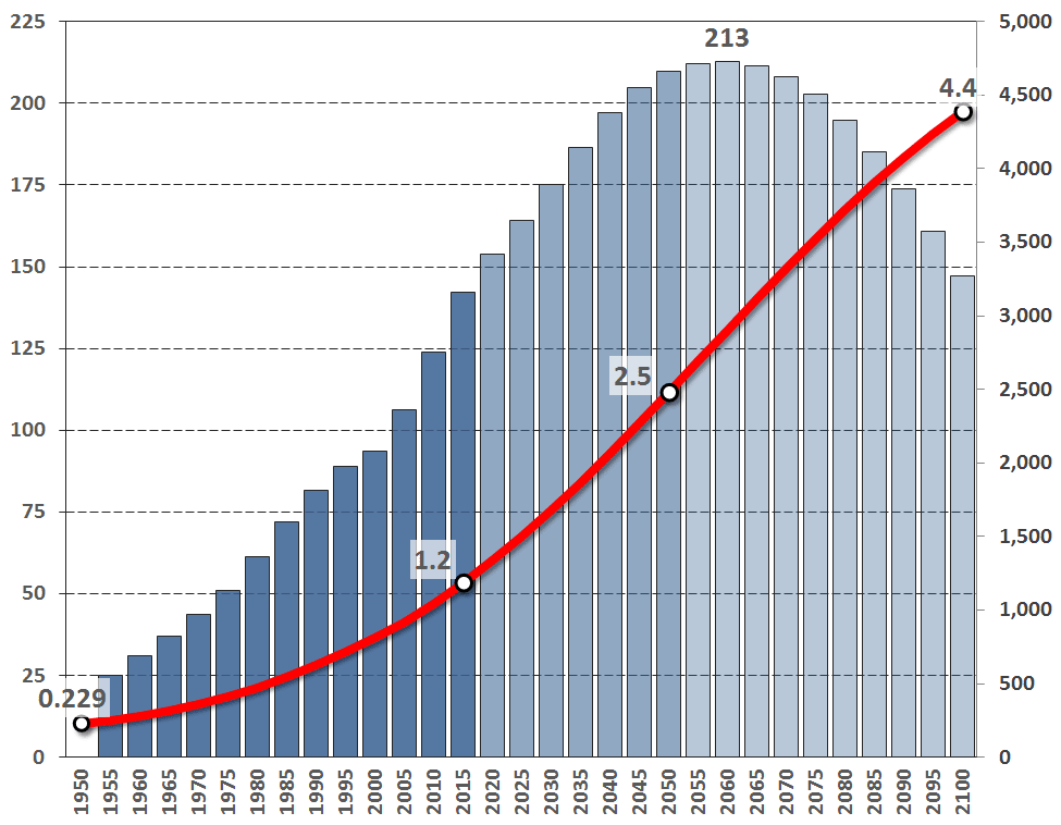
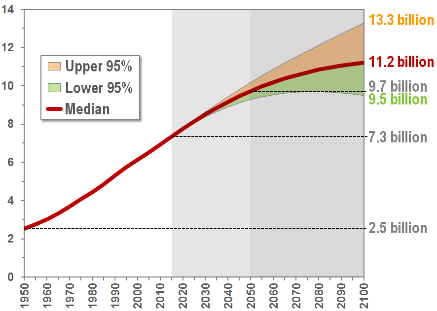
World: Population, 1950-2100
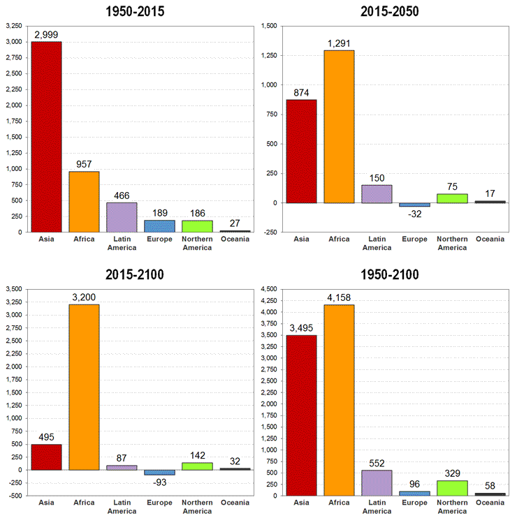
Five-year population increase, 1950-1955 to 2095-2100
Five-year population increase, 1950-1955 to 2095-2100

Source: United Nations, PPP2015. Population increase in millions; total population (red line) in billions.
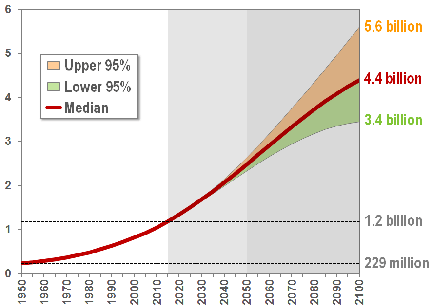
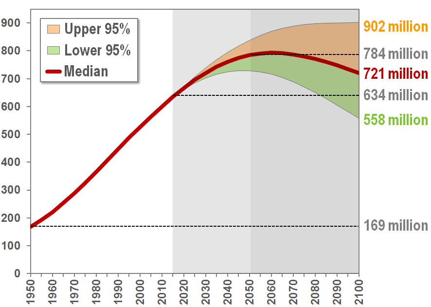
Africa: Population, 1950-2100
Five-year population increase, 1950-1955 to 2095-2100
Five-year population increase, 1950-1955 to 2095-2100
Source: United Nations, PPP2015. Population increase in millions; total population (red line) in billions.
World: Population, 1950-2100
Source: United Nations, PPP2015
Africa: Population, 1950-2100
Source: United Nations, PPP2015
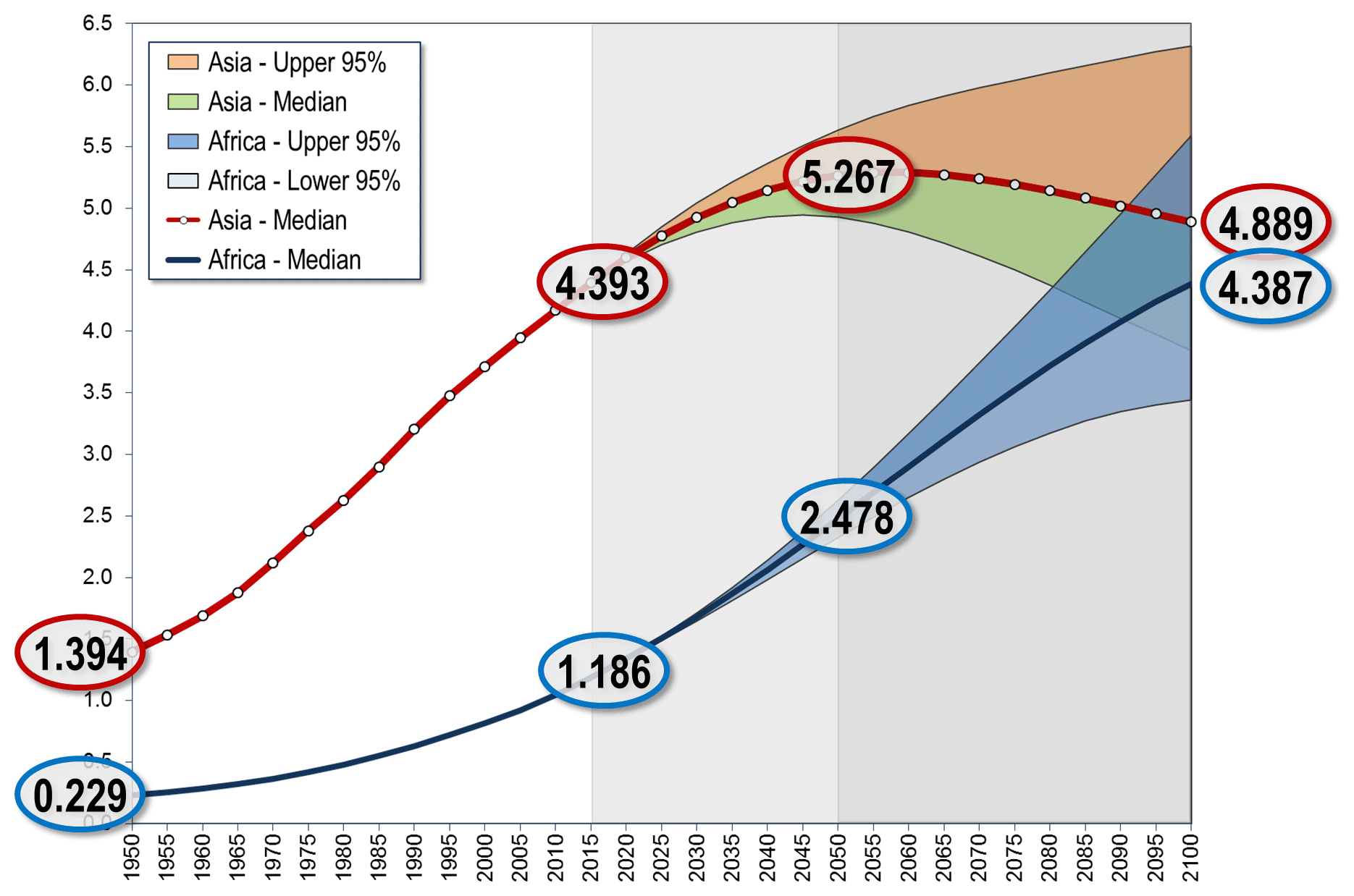
Asia: Population, 1950-2100
Source: United Nations, PPP2015
Europe: Population, 1950-2100
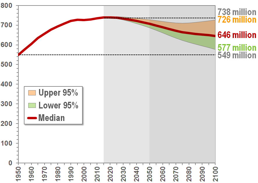
Source: United Nations, PPP2015
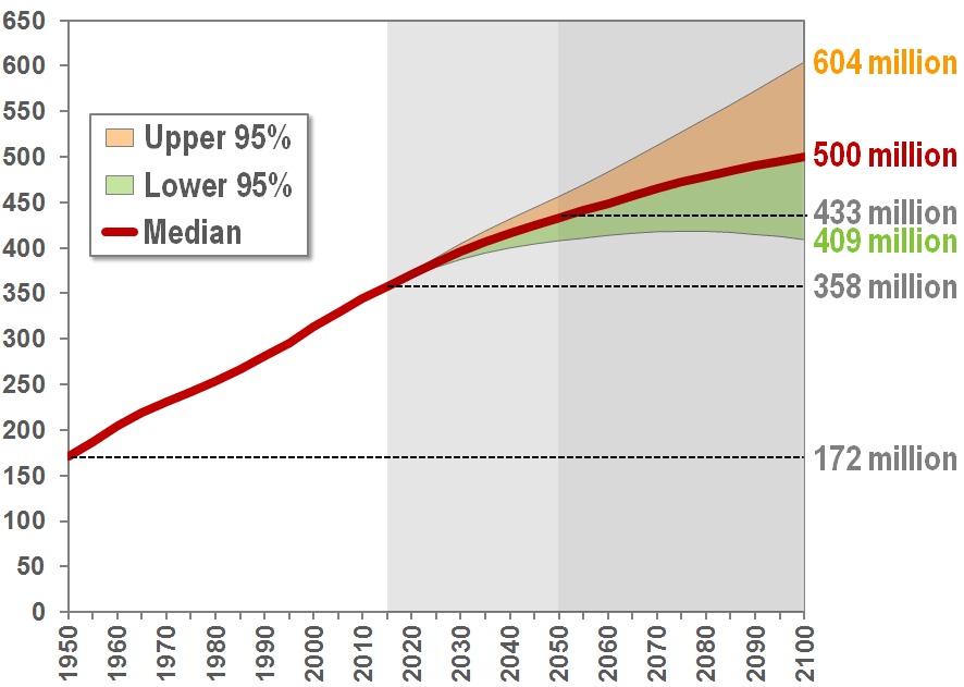
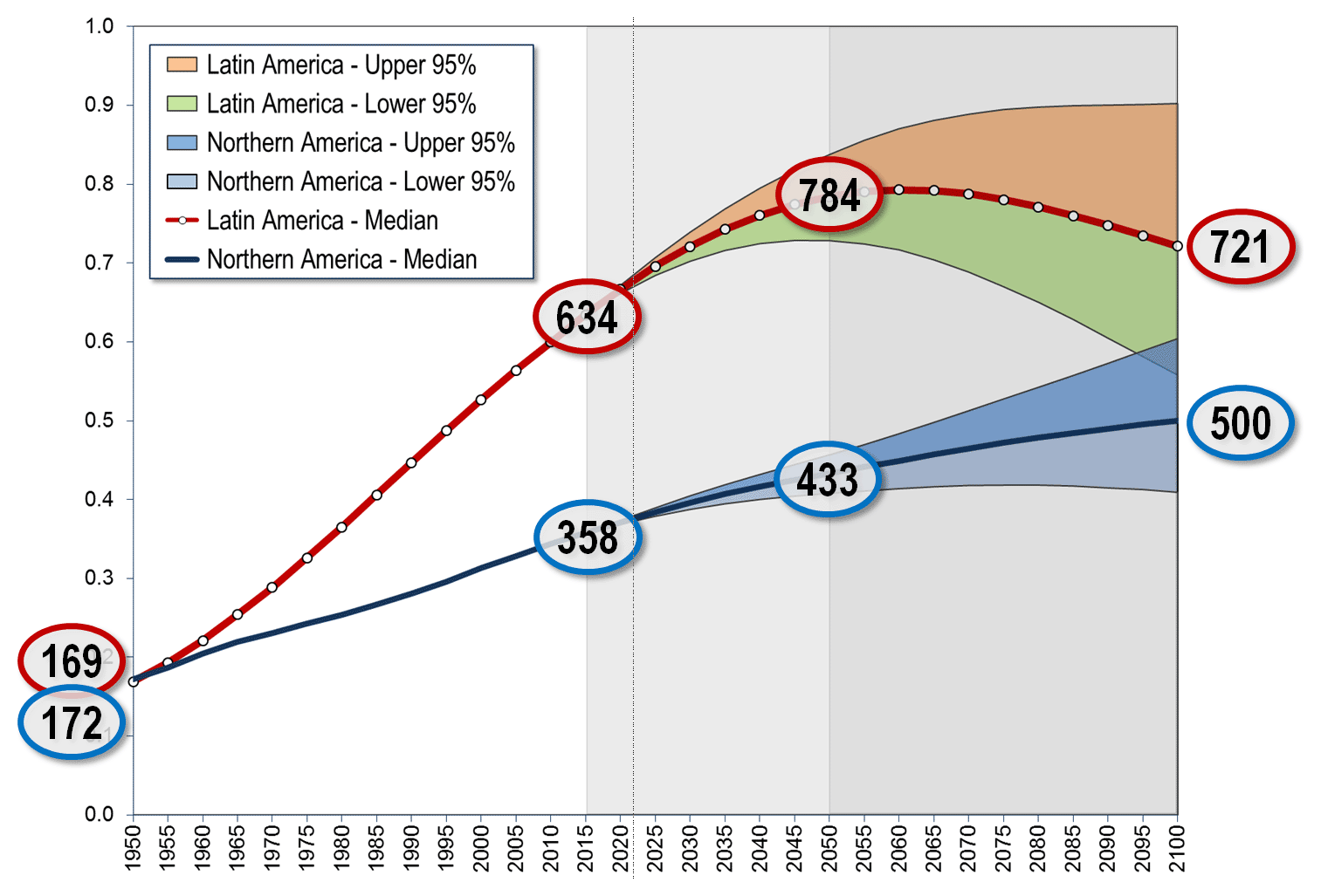
Latin America: Population, 1950-2100
Source: United Nations, PPP2015
Northern America: Population, 1950-2100
Source: United Nations, PPP2015
Africa vs. Europe: Population, 1950-2100
Source: United Nations, PPP2015
Latin America vs. Northern America: Population, 1950-2100
Source: United Nations, PPP2015
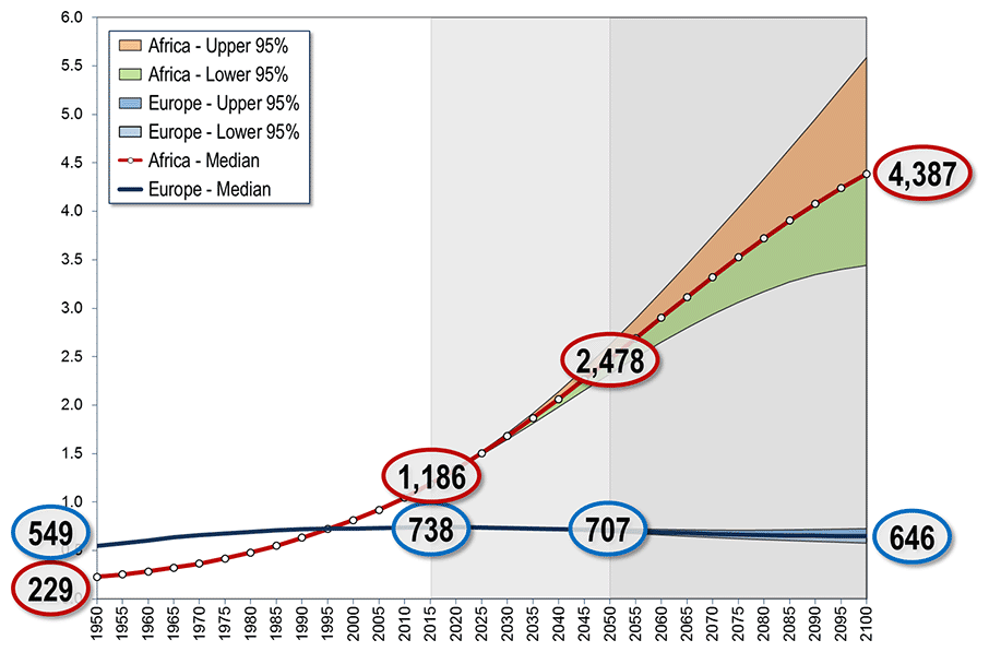
Asia vs. Africa: Population, 1950-2100
Source: United Nations, WPP2015
Population increase by region, 1950-2100
Source: United Nations, WPP2015
Population increase or decline by major regions
Source: United Nations, WPP2015
Population increase: Top 20 countries
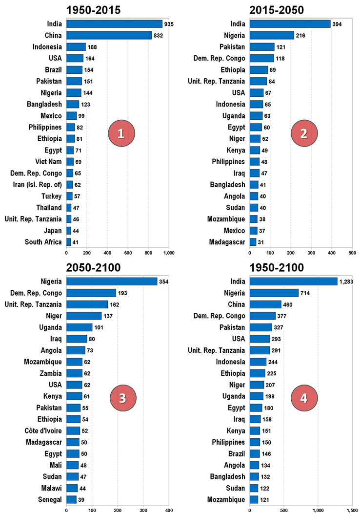
Source: United Nations, WPP2015
Population change: 1950-2100
Democratic Republic of the Congo, United Republic of Tanzania, Belarus
Democratic Republic of the Congo, United Republic of Tanzania, Belarus
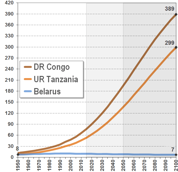
Source: United Nations, WPP2015
Population change: 1950-2100
Ethiopia, Egypt, Poland
Ethiopia, Egypt, Poland
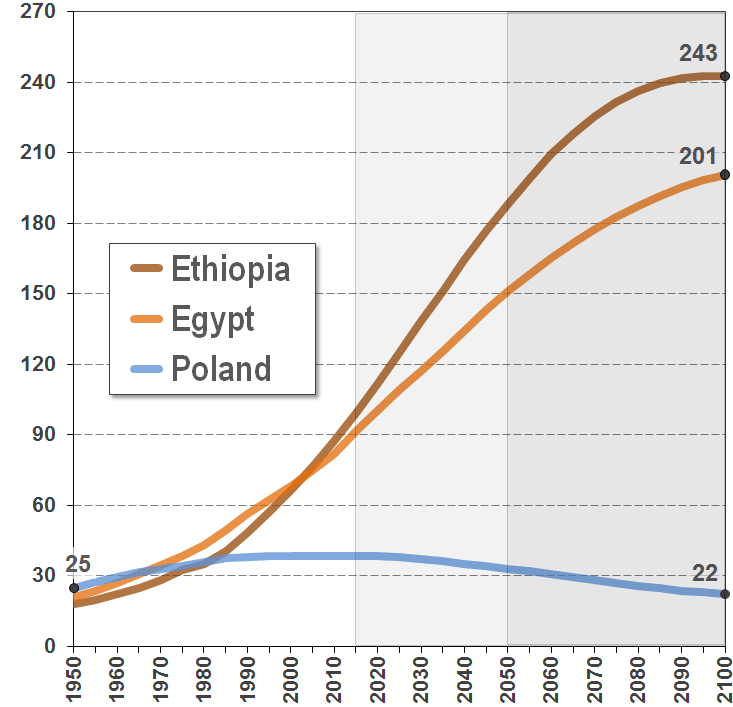
Source: United Nations, WPP2015
Population change: 1950-2100
Nigeria, Pakistan, Ukraine
Nigeria, Pakistan, Ukraine
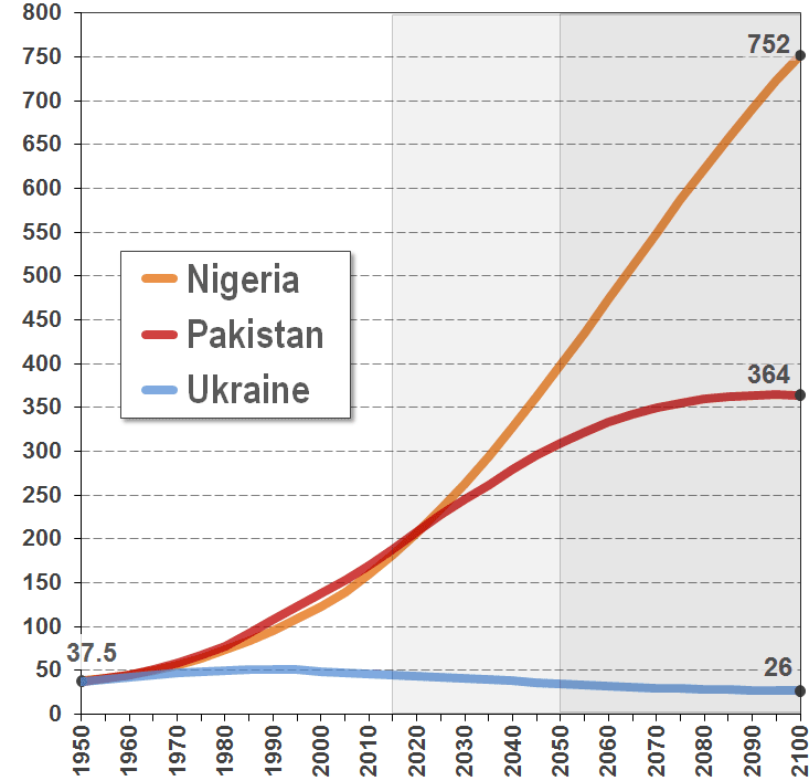
Source: United Nations, WPP2015
Population change: 1950-2100
Niger, Iraq, Bulgaria
Niger, Iraq, Bulgaria
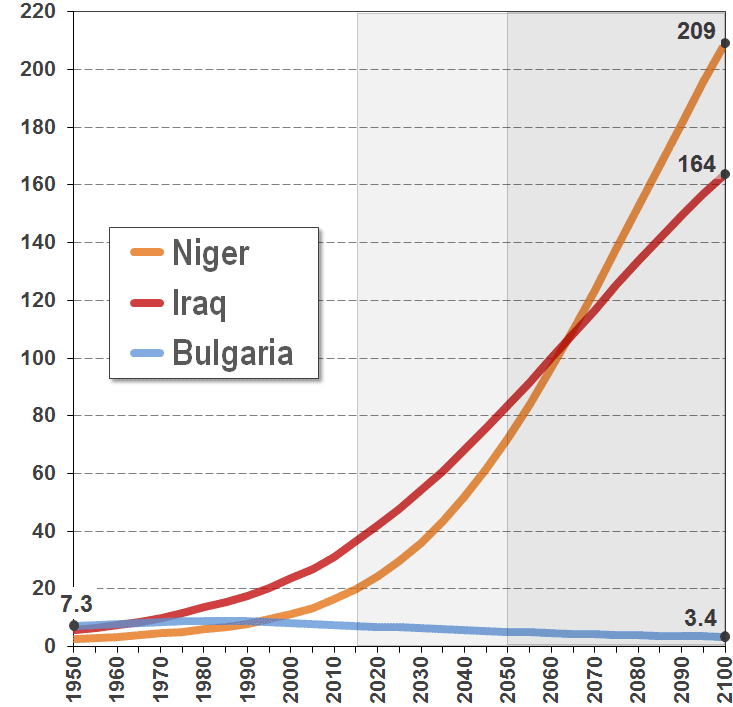
Source: United Nations, WPP2015
Population change: 1950-2100
The United States of America, Western Europe and the Russian Federation
The United States of America, Western Europe and the Russian Federation
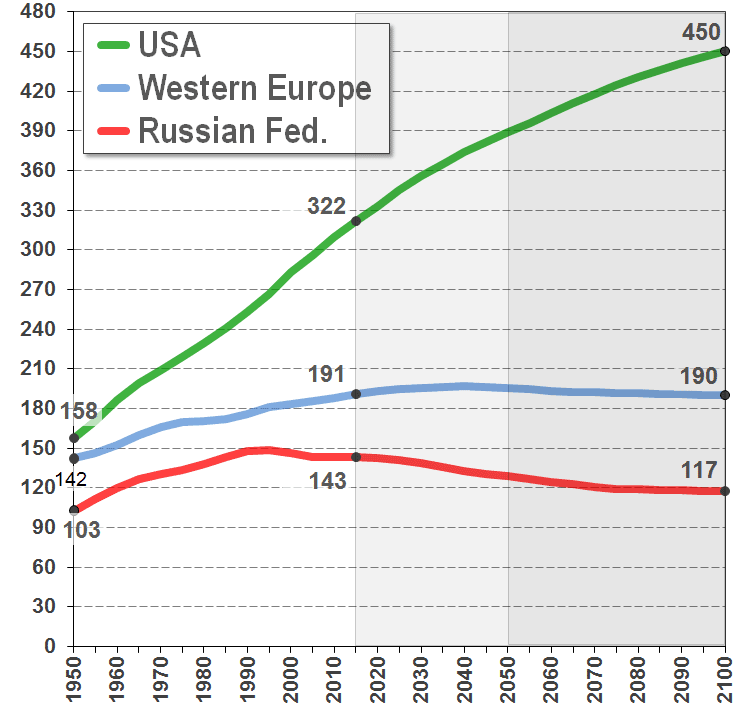
Source: United Nations, WPP2015
Europe: Births & Deaths, 1950-2100
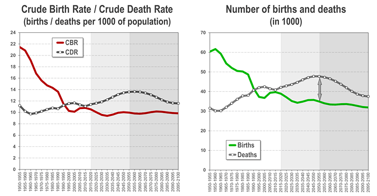
Source: United Nations, WPP2015
Africa: Births & Deaths, 1950-2100
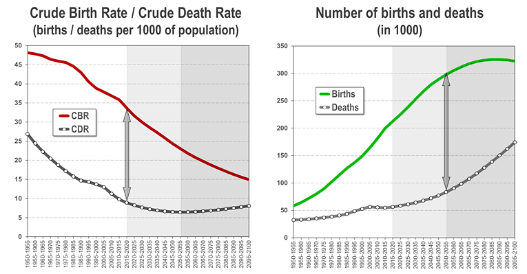
Source: United Nations, PPP2015
Asia: Births & Deaths, 1950-2100
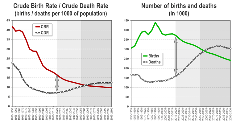
Source: United Nations, PPP2015
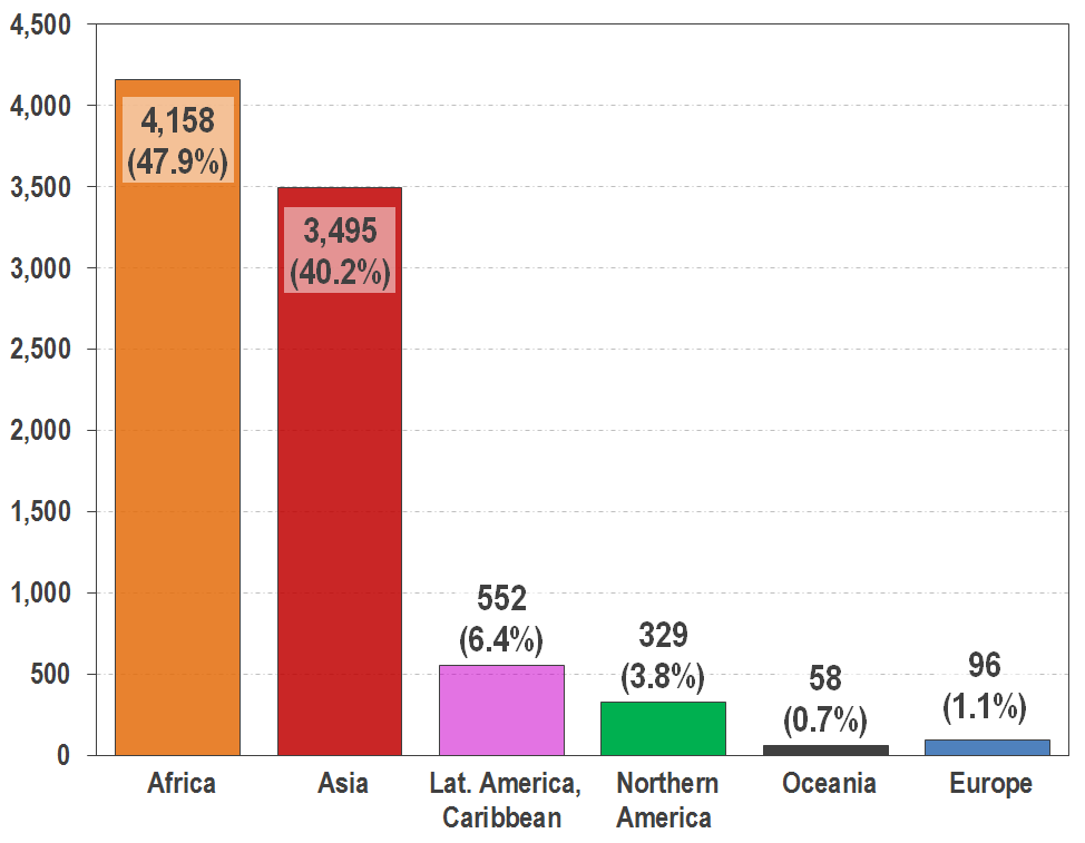
World population by major regions, 1950-2100
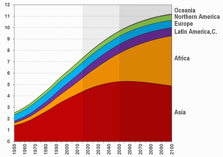
Source: United Nations, WPP2015
Percentage of world population by major regions, 1950-2100
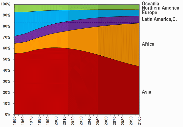
Source: United Nations, WPP2015
Share of world population by major regions
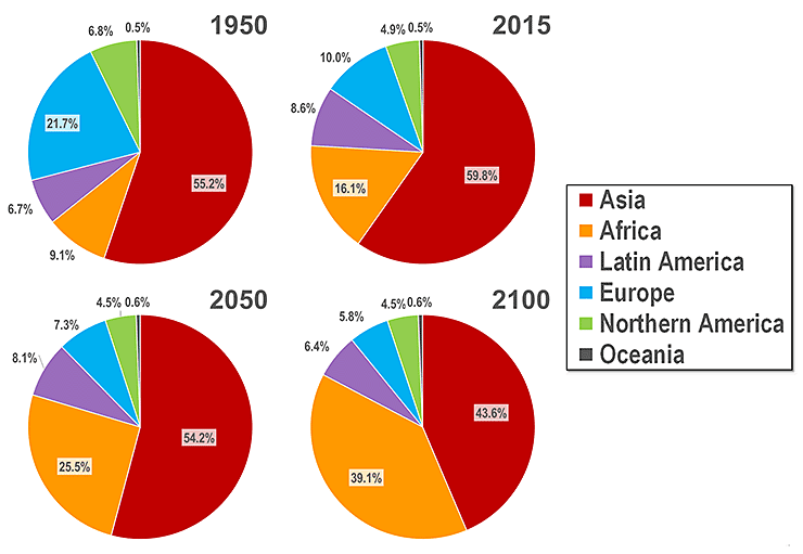
Source: United Nations, PPP2015
Population density by major regions, 2014, 2050, 2100
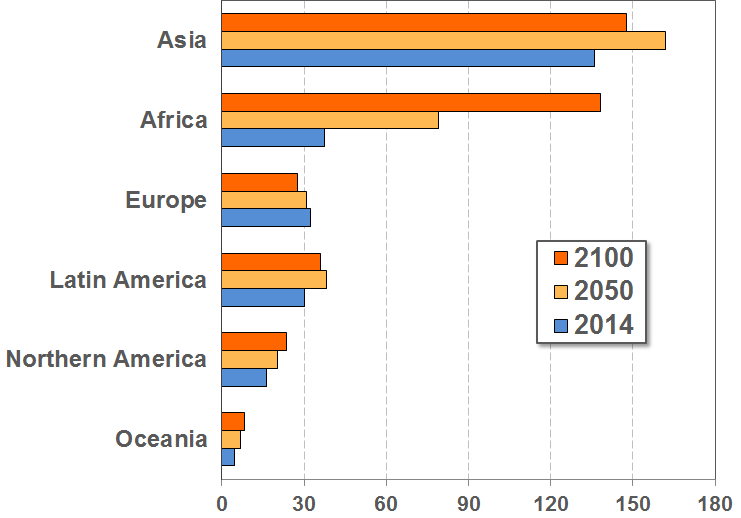
Chart prepared by Gerhard K. Heilig, 2014; Data source: United Nations, WPP2012: Medium Variant.
Population density by sub-regions
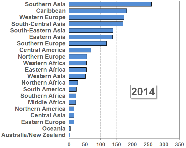
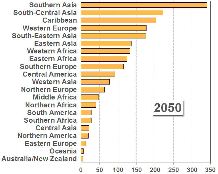
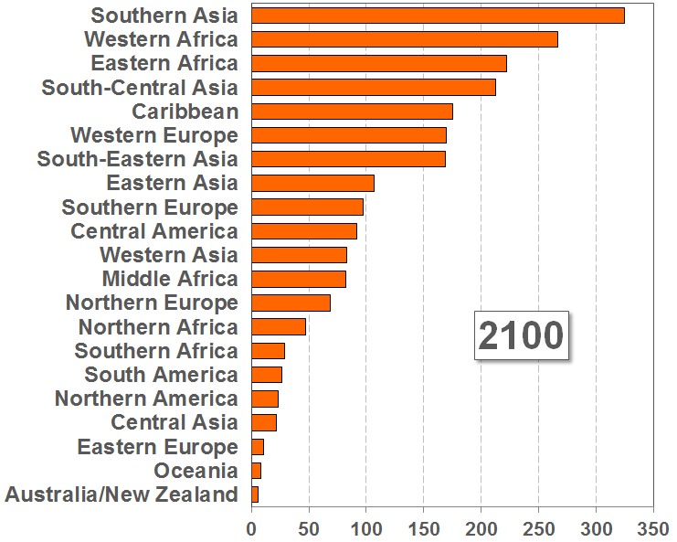
Chart prepared by Gerhard K. Heilig, 2014; Data source: United Nations, WPP2012: Medium Variant.
Population density: Top-50 most densely populated countries in 2015
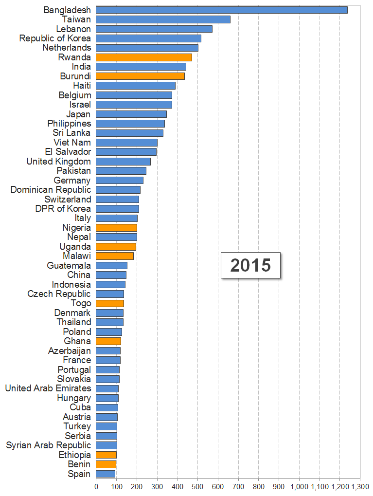
Chart prepared by Gerhard K. Heilig, 2016; Data source: United Nations, WPP2015: Medium Variant.
Population density: Top-50 most densely populated countries in 2050
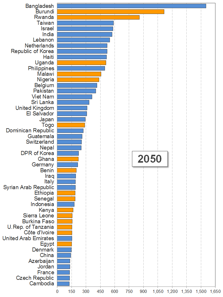
Chart prepared by Gerhard K. Heilig, 2016; Data source: United Nations, WPP2015: Medium Variant.
World: Population aged 0-24, 25-49, 50+
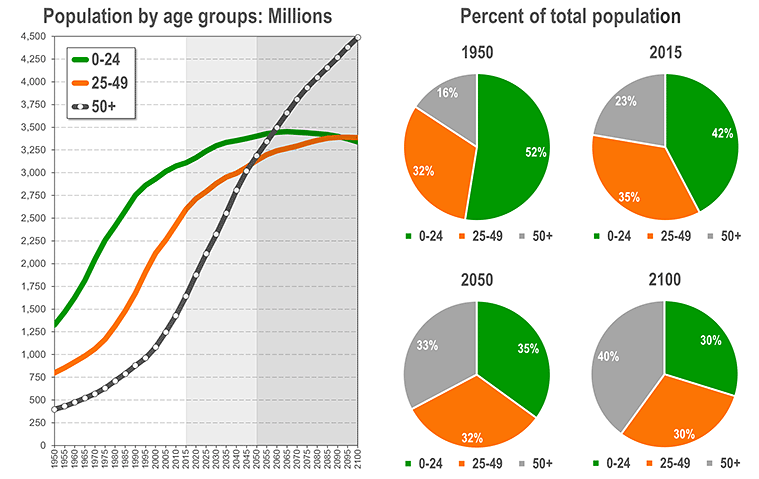
Chart by GKH. Data source: United Nations, WPP2015
Asia: Population aged 0-24, 25-49, 50+
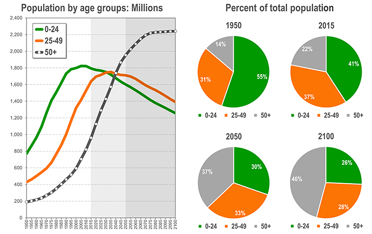
Chart by GKH. Data source: United Nations, WPP2015
Africa: Population aged 0-24, 25-49, 50+
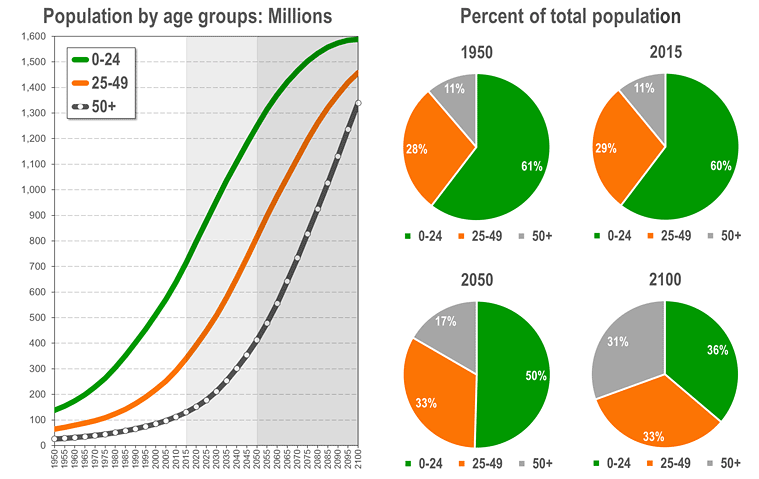
Chart by GKH. Data source: United Nations, WPP2015
Europe: Population aged 0-24, 25-49, 50+
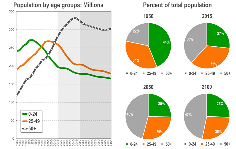
Chart by GKH. Data source: United Nations, WPP2015
Africa vs. Europe:
Population aged 0-24, 25-49, 50+ (percent)
Population aged 0-24, 25-49, 50+ (percent)
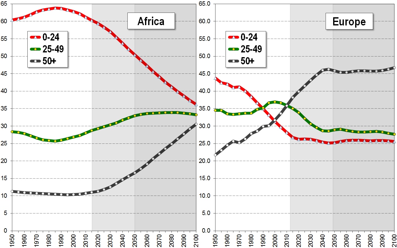
Chart by GKH. Data source: United Nations, WPP2015
Africa vs. Europe:
Population aged 0-24 (millions)
Population aged 0-24 (millions)
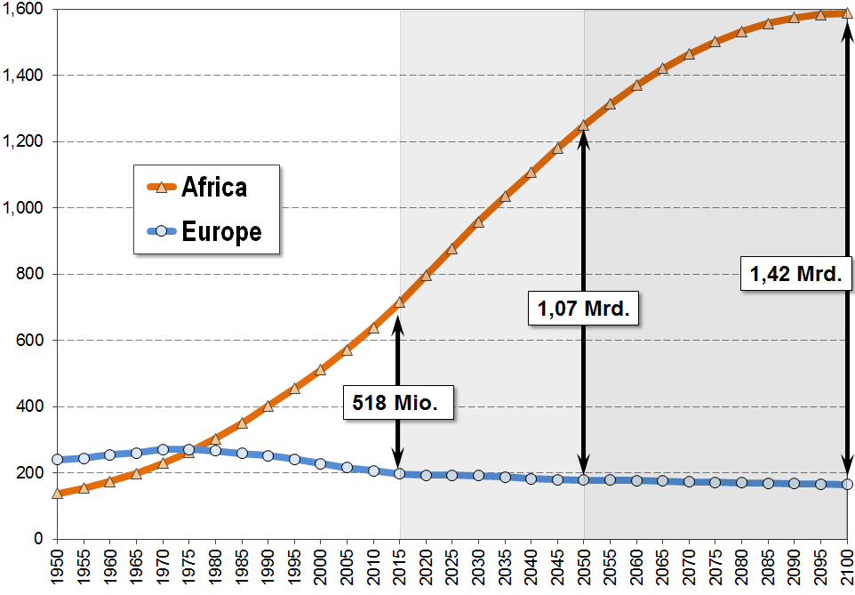
Chart by GKH. Data source: United Nations, WPP2015
Population aging
Animation by GKH. Data source: United Nations, WPP2006
Median age by major regions
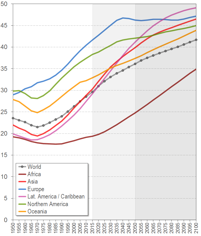
Chart by GKH. Data source: United Nations, WPP2015
Median age: Selected countries
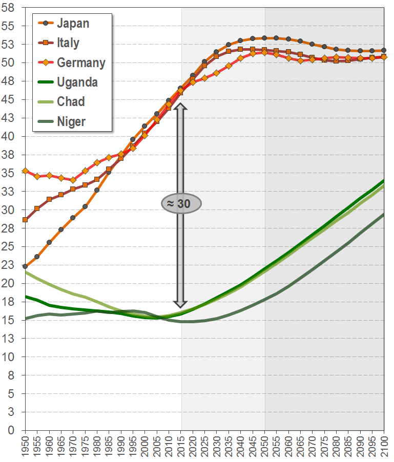
Chart by GKH. Data source: United Nations, WPP2015
World: Population age 0-19, 20-49 and 50+
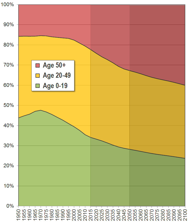
Chart by GKH. Data source: United Nations, WPP2015
World: Population aged 0-4 and 65+ (millions)
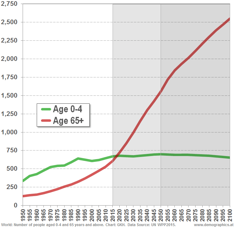
Chart by GKH. Data source: United Nations, WPP2015
Africa: Population aged 0-4 and 65+ (millions)
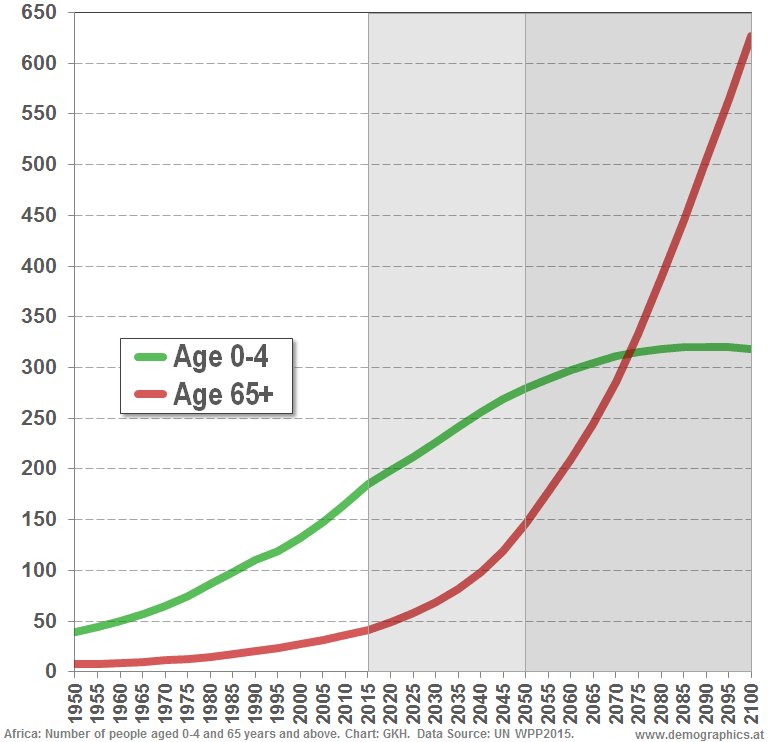
Chart by GKH. Data source: United Nations, WPP2015
Asia: Population aged 0-4 and 65+ (millions)
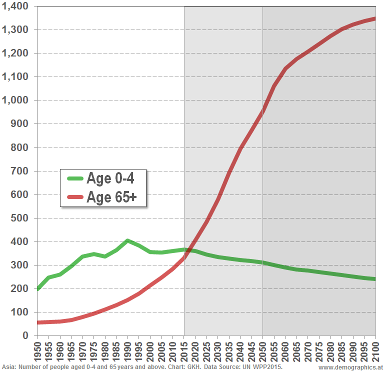
Chart by GKH. Data source: United Nations, WPP2015
Europe*: Population aged 0-4 and 65+ (millions)
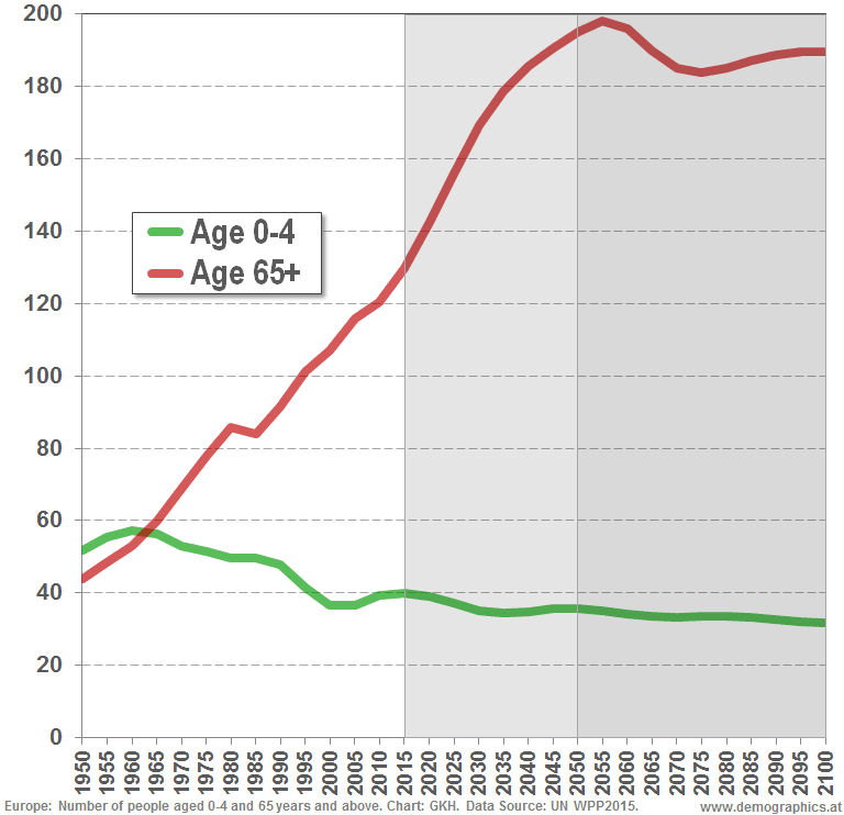
Chart by GKH. Data source: United Nations, WPP2015
Latin America & Caribbean: Population aged 0-4 and 65+ (millions)
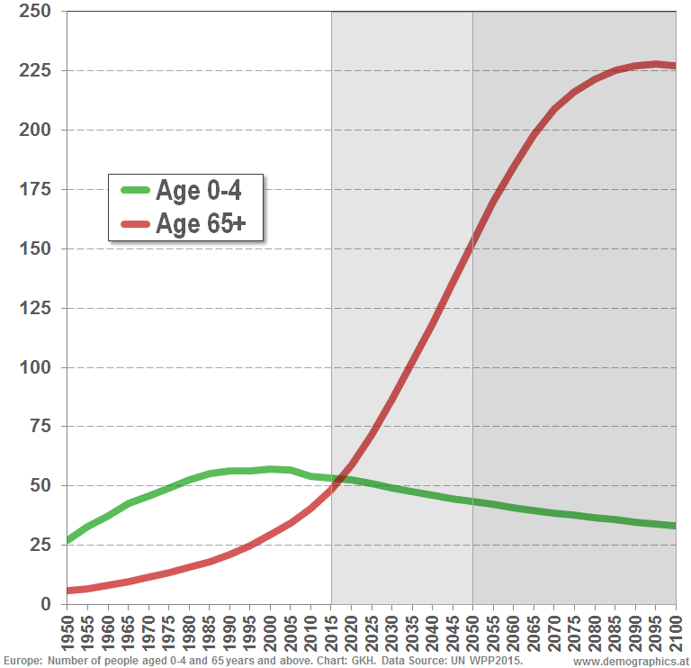
Chart by GKH. Data source: United Nations, WPP2015
Northern America: Population aged 0-4 and 65+ (millions)
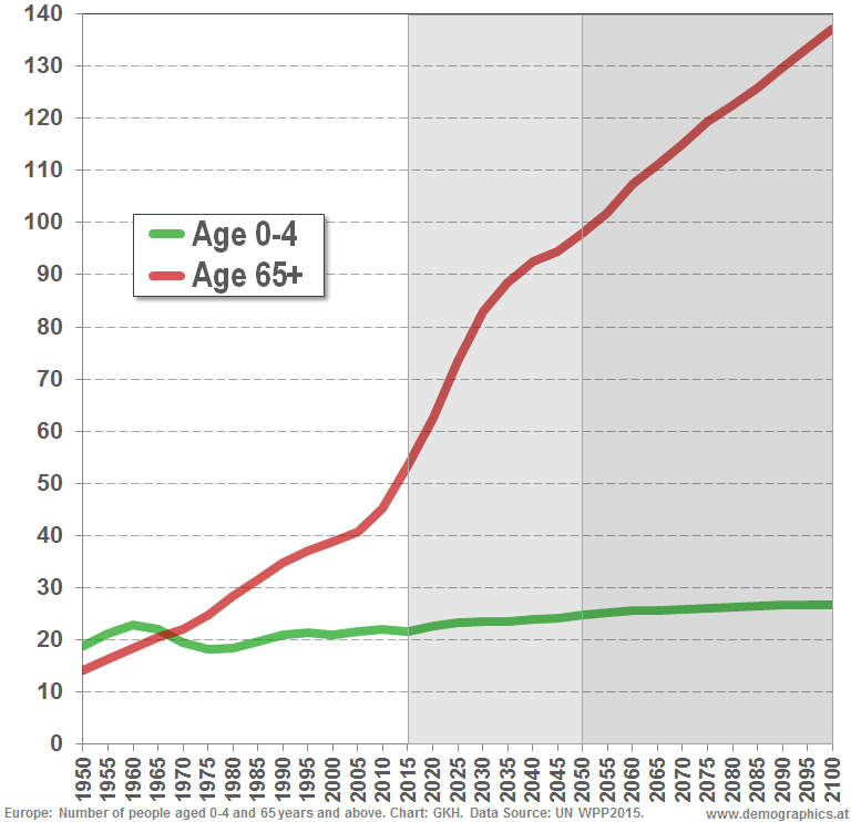
Chart by GKH. Data source: United Nations, WPP2015
Analysis: Population aging and fertility decline
Correlation between a decline in total fertility and an increase in median age of the population for all countries of the world
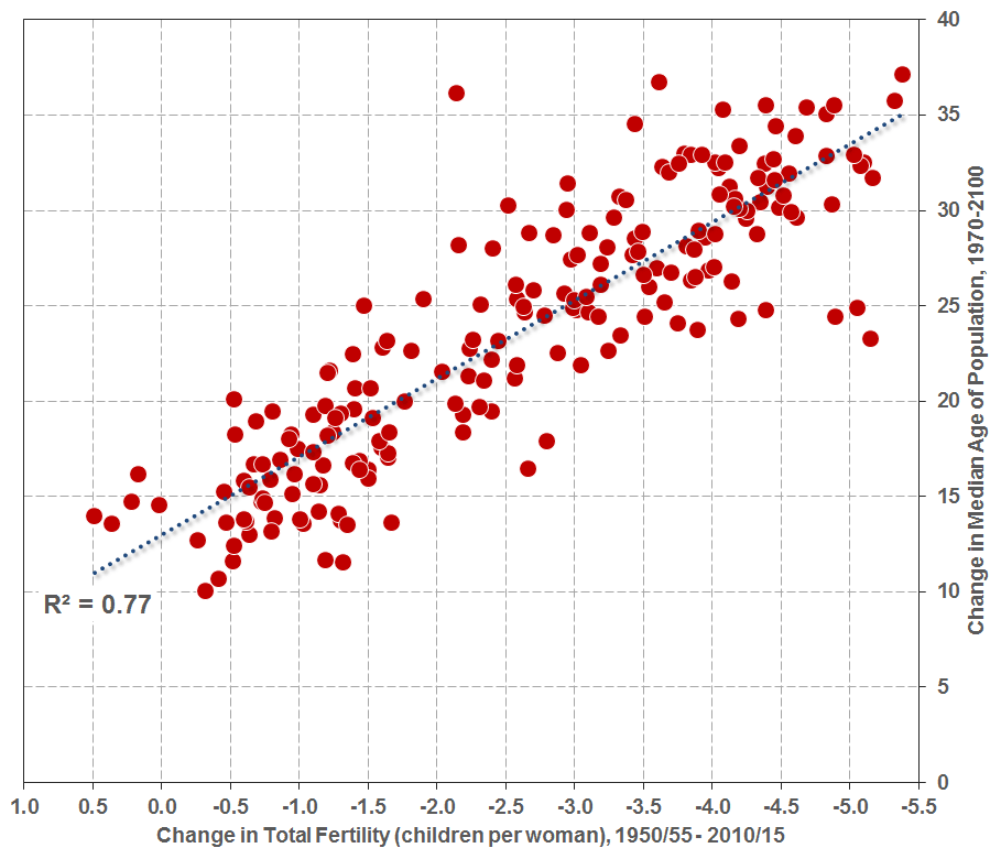
Chart by GKH. Data source: United Nations, WPP2015
Correlation between a decline in total fertility and an increase in old-age dependency ratios for all countries of the world
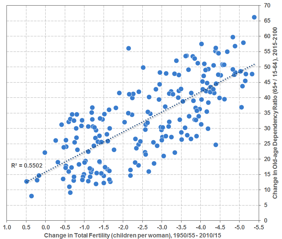
Chart by GKH. Data source: United Nations, WPP2015
Urban and rural population by major region.
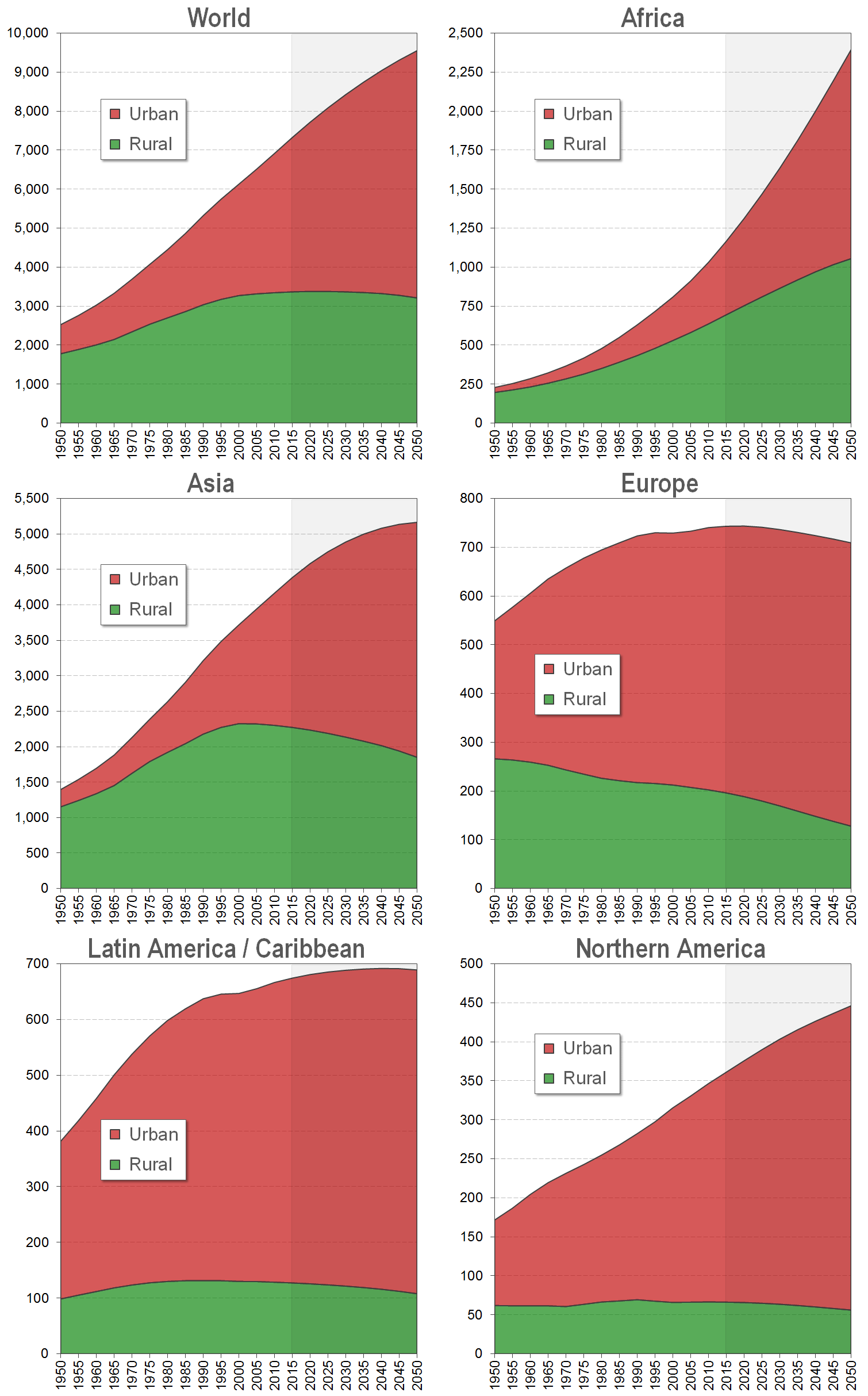
Chart by GKH. Data source: United Nations WUP2014
Top-20 countries: Urban population, 2014.
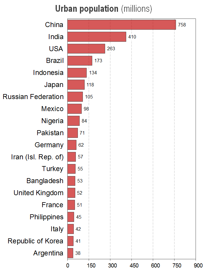
Chart by GKH. Data source: United Nations WUP2014
Top-20 countries: Rural population, 2014.
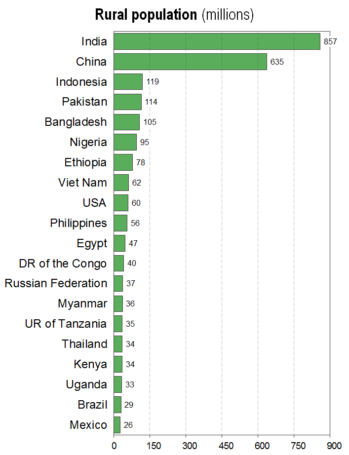
Chart by GKH. Data source: United Nations WUP2014
Urban population by regions: 1950, 2015, 2050.

Chart by GKH. Data source: United Nations WUP2014
Urbanization: Definition problems
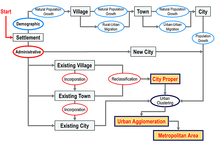
Diagram by GKH.
Common advantages and disadvantages of urban life
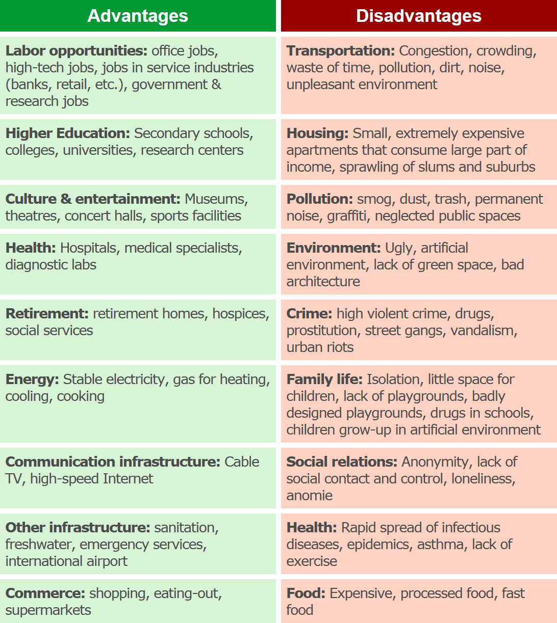
Table by GKH.
Europe: Urbanization and expansion of natural land cover, 1900 and 2010
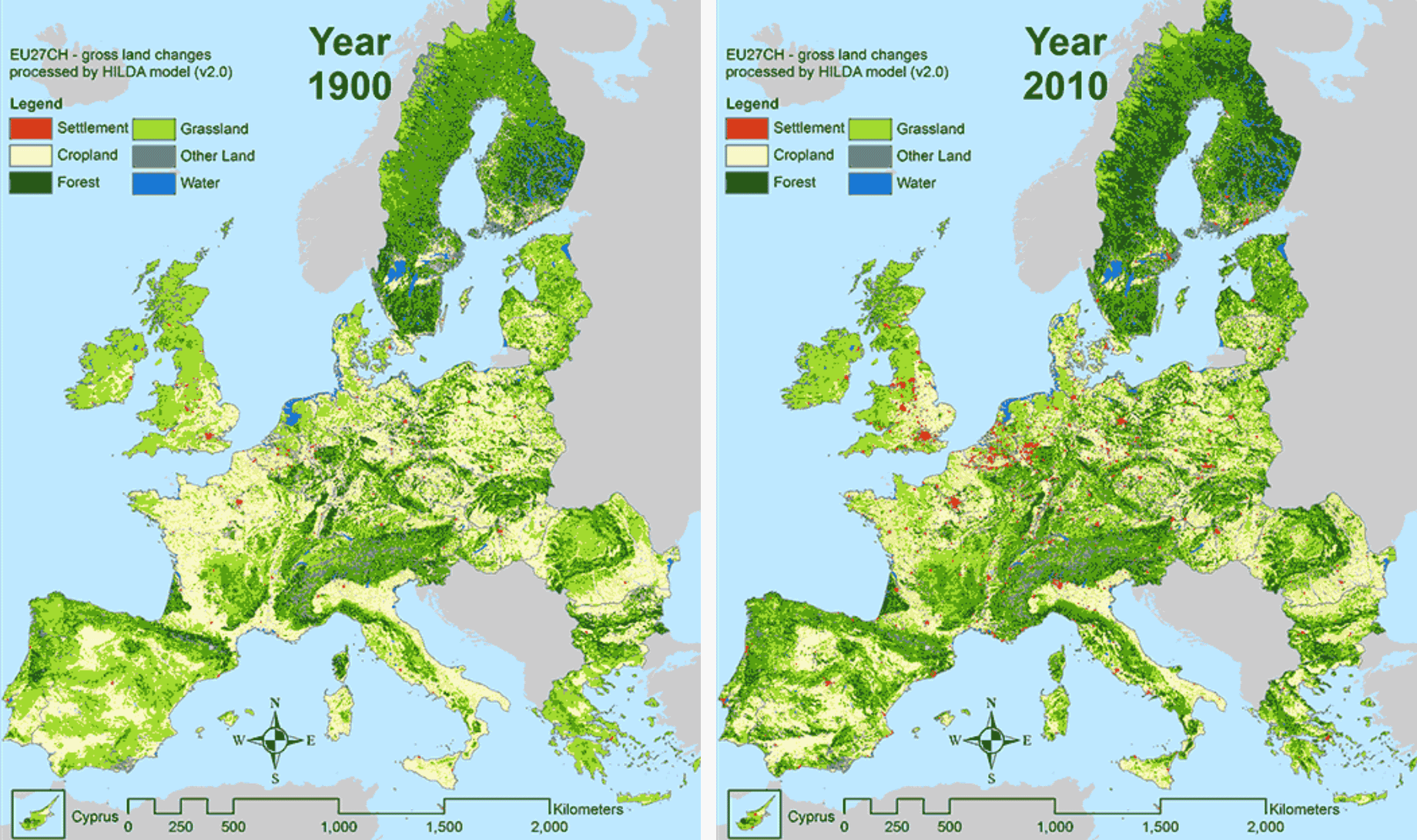
HILDA v2.0 gross land changes
Urban Problems
Air pollution

Beijing air pollution. Photo from Wikimedia Commons.
Poor garbage collection

Garbage on Naples streets. Photo by LHOON, Taken on June 6, 2007
Traffic congestion
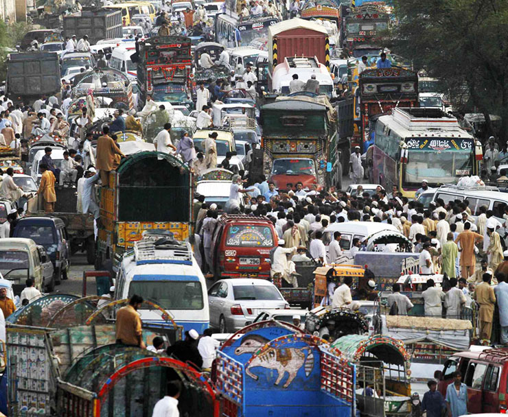
Photo by Wikipedia Commons
Poor-quality housing

Photo Wikipedia Commons
Bad, inhumane architecture

By 'Matthew G. Bisanz, CC BY-SA 3.0, https://commons.wikimedia.org/w/index.php?curid=7789381
Bad urban planning
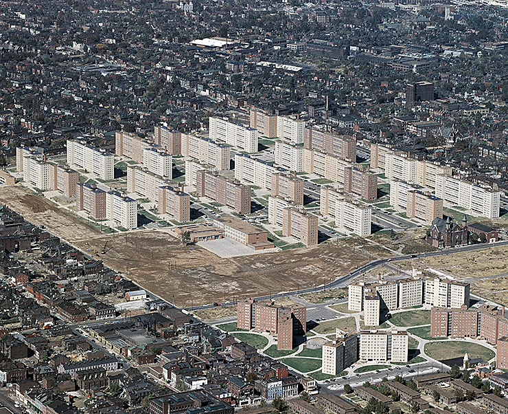
Photo Pruitt–Igoe housing scheme in St Louis, Missouri - United States Geological Survey, from their website. Licensed under Public Domain via Wikimedia Commons - https://commons.wikimedia.org/wiki/File:Pruitt-igoeUSGS02.jpg#/media/File:Pruitt-igoeUSGS02.jpg
Car-centered city design
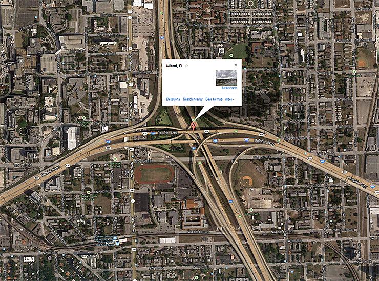
Image: Google Map (satellite image) of Miami, FL, USA.
Vast mega-cities

Photo: Shinjuku Skyline Tokyo, Japan. October, 1996, Author: Kronks
Insufficient public transport

Photo: Rush hour at Shinjuku 02 by Chris 73 - Chris 73. Licensed under CC BY-SA 3.0 via Wikimedia Commons.
Noise pollution

Plane landing San Diego Linburg Field airport. Photo: Harry and Rowena Kennedy Taken on October 3, 2014 - via Wikimedia Commons.
Vandalism - Graffiti


CC0 Public Domain.
Vandalism - Other

Vandalism at Hebden Bridge station, Calderdale, Great Britain. Copyright Phil Champion and licensed for reuse under this Creative Commons Licence.
Looting & crime

Sunday 7 August 2011. Riot damage Inside The Two Brewers in Scotland Green, just off High Road Tottenham. Photo by Alan Stanton, Creative Commons.
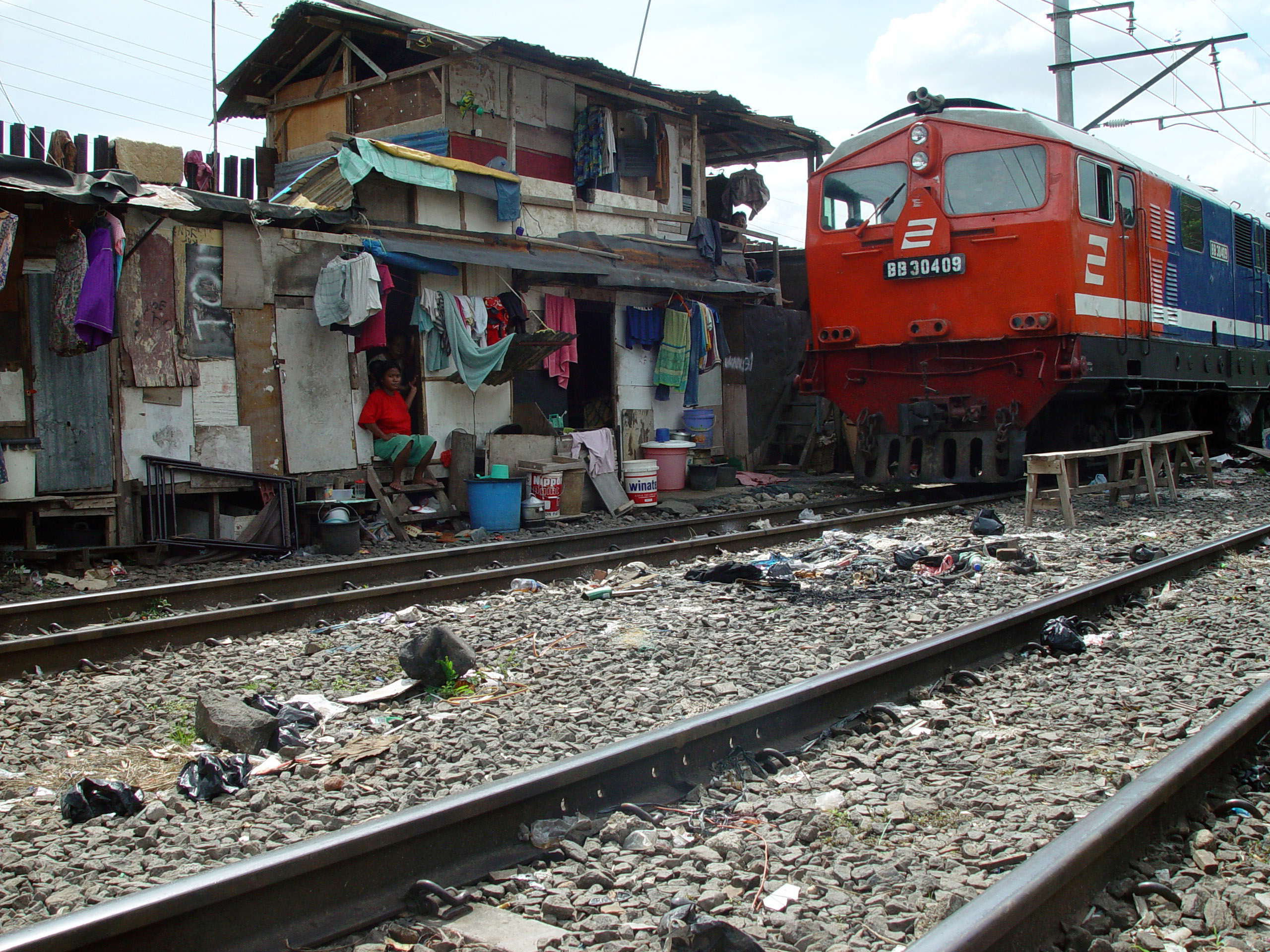
Slums and informal settlements
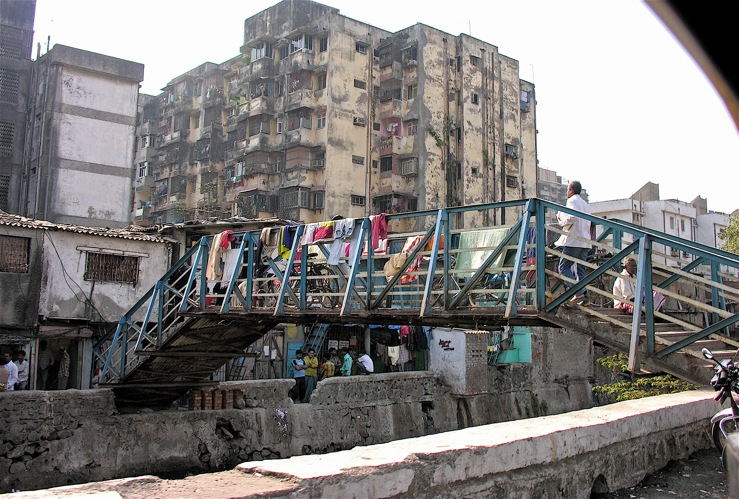
By Jon Hurd - originally posted to Flickr as Dharavi Slum, CC BY 2.0, https://commons.wikimedia.org/w/index.php?curid=4153374

CC0, https://commons.wikimedia.org/w/index.php?curid=30442496
By Jonathan McIntosh - Own work, CC BY 2.0, https://commons.wikimedia.org/w/index.php?curid=70041
Total fertility: Africa, World, Europe
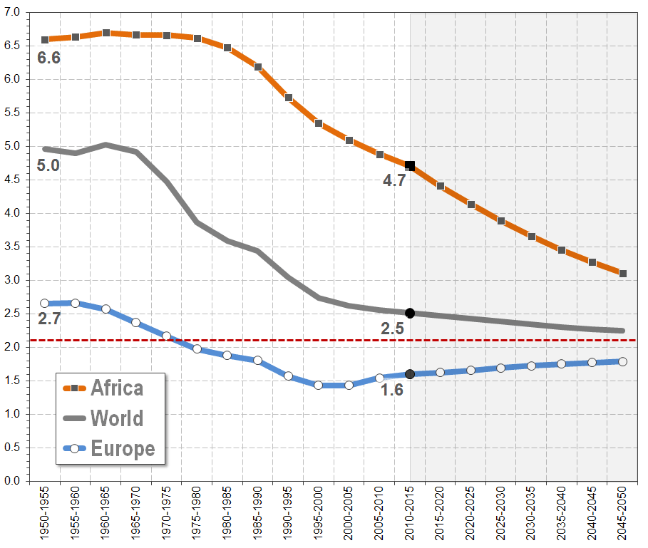
Chart by GKH. Data source: United Nations, WPP2015
Total fertility: Europe, Northern America
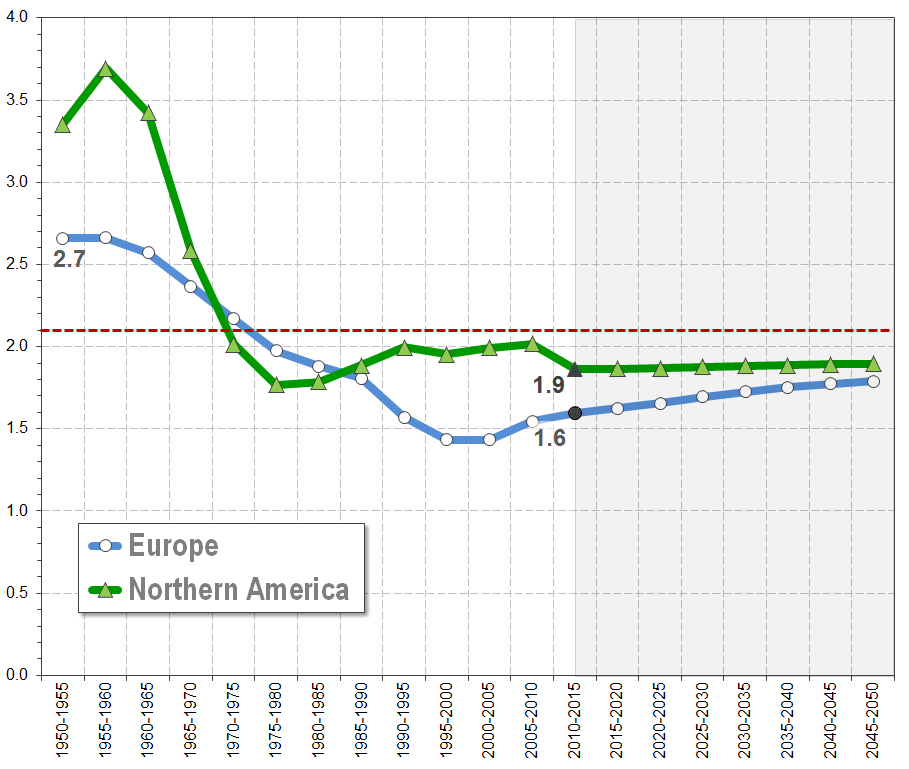
Chart by GKH. Data source: United Nations, WPP2015
Total fertility: Africa, Asia, Latin America / Caribbean
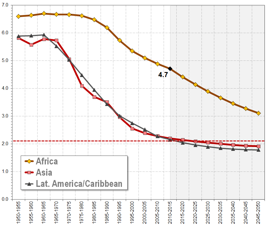
Chart by GKH. Data source: United Nations, WPP2015
Total fertility:
Countries with TFR > 2.5, 2010-2015
Countries with TFR > 2.5, 2010-2015
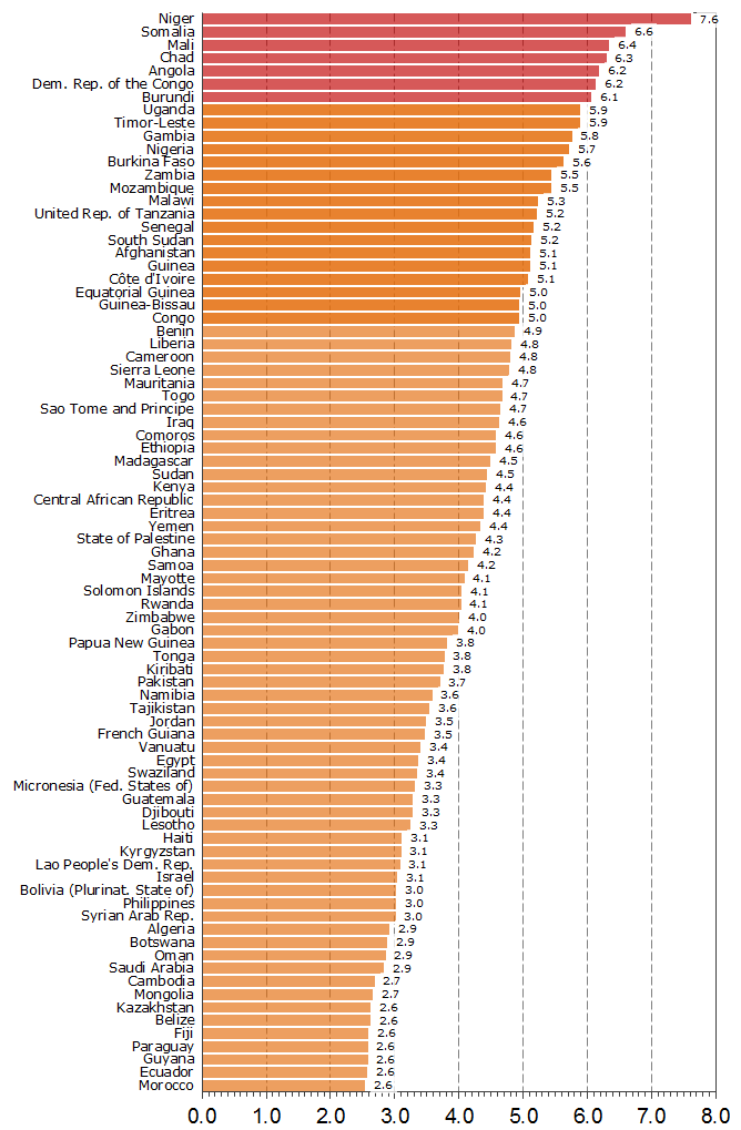
Chart by GKH. Data source: United Nations, WPP2015
Total fertility:
Countries with TFR < 2.1, 2010-2015
Countries with TFR < 2.1, 2010-2015
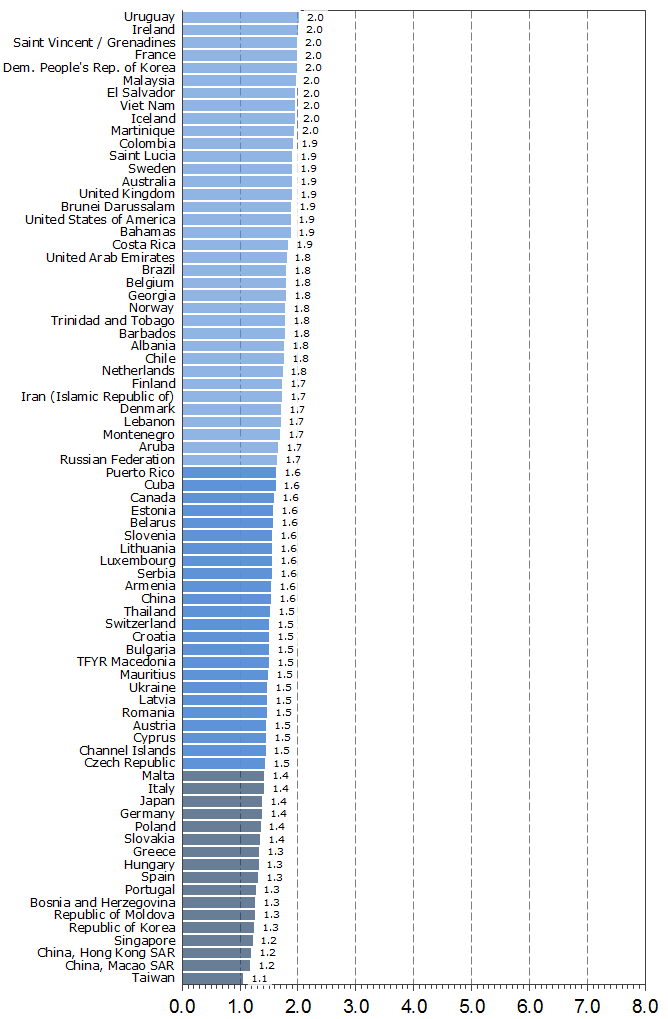
Chart by GKH. Data source: United Nations, WPP2015
World population by level of total fertility, 1950 to 2100
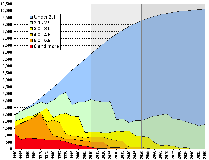
Chart by GKH. Data source: United Nations, WPP2010
European Union: Estimates of total fertility, 1960-2013
_YB15.png)
Chart by GKH. Data source: United Nations, WPP2015
European Union: Total fertility and mean age at childbirth, 2001-2013

Chart by GKH. Data source: EUROSTAT
European countries: Total fertility (children per woman), 2013
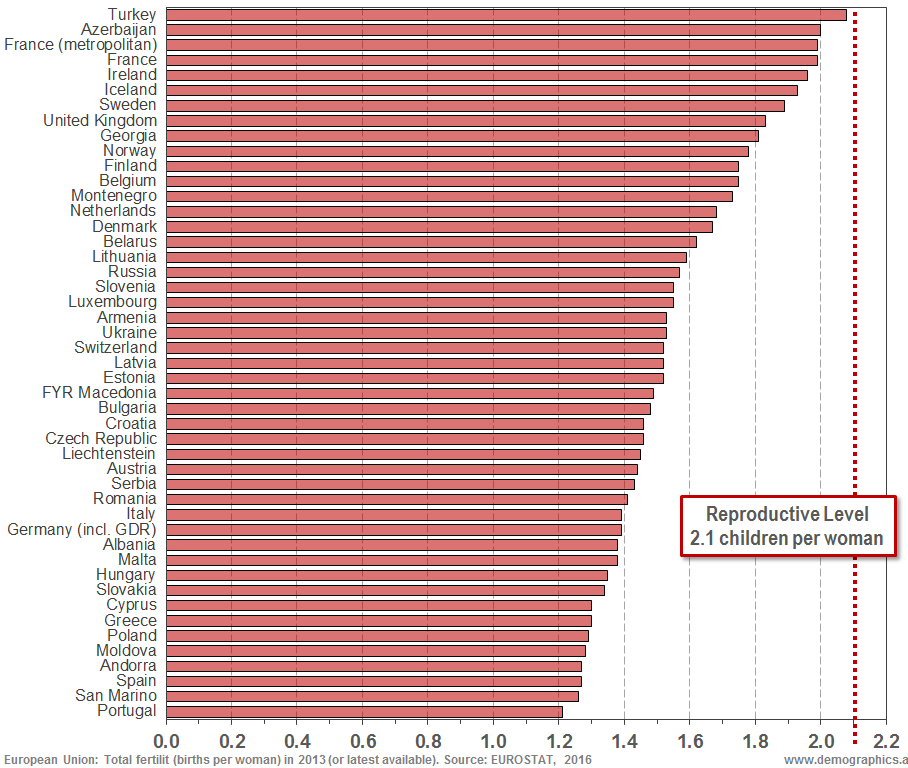
Chart by GKH. Data source: EUROSTAT, 2016
European countries: Mean age of women at birth of first child. Difference to EU(28) average, 2013
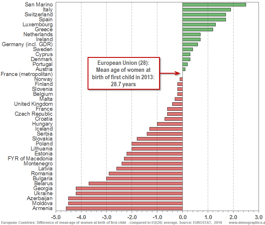
Chart by GKH. Data source: EUROSTAT, 2016
Countries in Europe and Western Asia
Proportion of live births out of marriage, 2013
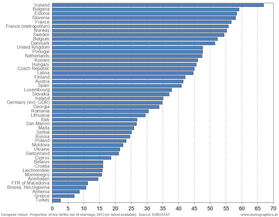
Chart by GKH. Data source: EUROSTAT, 2016
Proportion of live births out of marriage - as compared to EU(28) average, 2013
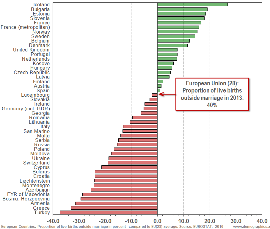
Chart by GKH. Data source: EUROSTAT, 2016
Net Reproduction Rate (NRR)
Net Reproduction Rate by major regions, 1950-2050
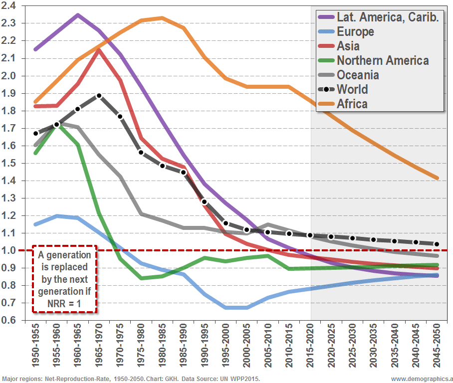
Chart by GKH. Data source: UN WPP2015
Countries with the highest Net Reproduction Rate in 2010-2015

Chart by GKH. Data source: UN WPP2015
Countries with the lowest Net Reproduction Rate in 2010-2015
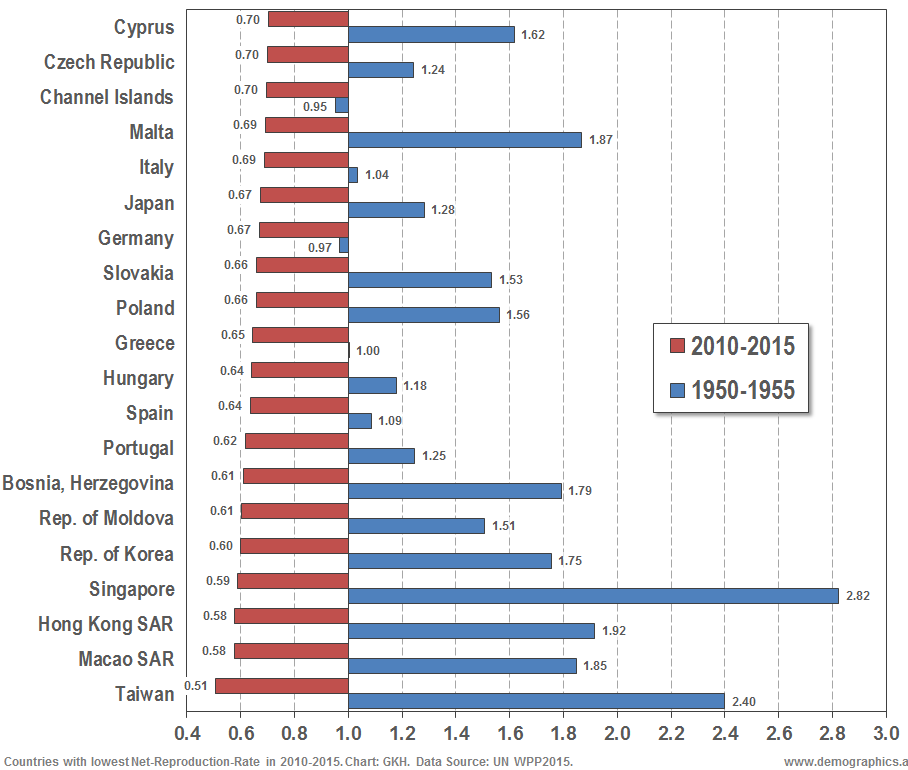
Chart by GKH. Data source: UN WPP2015
Infant and child mortality
Figure 1: Infant mortality by region, 1950/55 - 2010/15
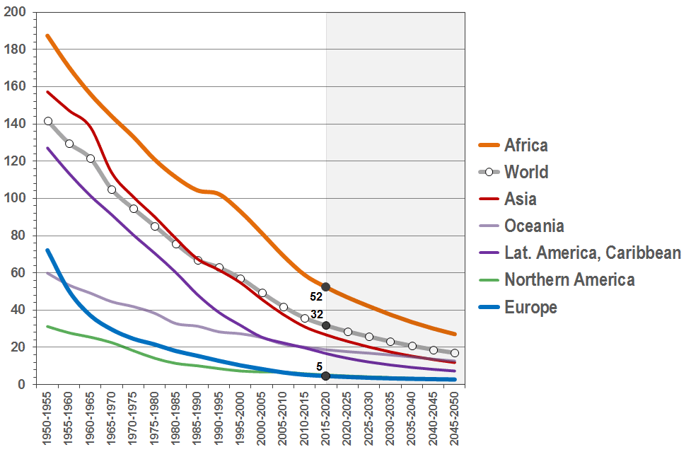
Chart by GKH. Note: The infant mortality is the probability of dying between birth and exact age 1. It is expressed as deaths per 1,000 live births. Data source: United Nations, WPP2015
Figure 2: Under-five mortality by region, 1950/55 - 2010/15
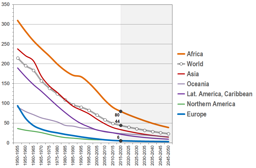
Chart by GKH. Note: The under-five mortality is the probability of dying between birth and exact age 5. It is expressed as deaths per 1,000 births. Data source: United Nations, WPP2015
Life expectancy at birth
Figure 1: Life expectancy at birth by major regions, 1950-2050
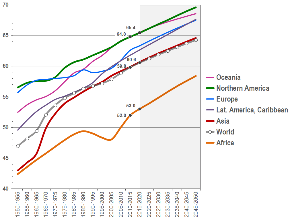
Chart by GKH. Note: Scale starts at age 40. Data source: United Nations, WPP2015
Figure 2: Life expectancy at birth by country: Highest & lowest in 2010-2015
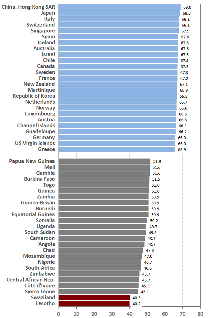
Chart by GKH. Data source: United Nations, WPP2015
Figure 3: Changes in life expectancy at birth: Highest & lowest change, 1950/55 - 2010/15
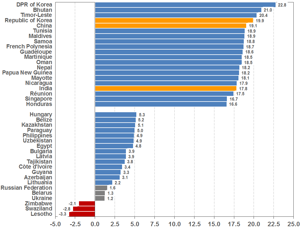
Chart by GKH. Data source: United Nations, WPP2015
Adult mortality
Figure 1: Life expectancy at age 65 by major regions, 1950-2050
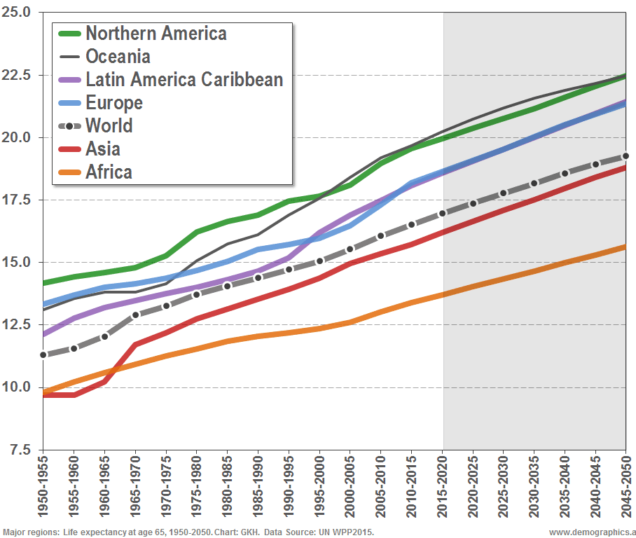
Chart by GKH. Note: Y-Axis starts at 7.5 years. Data source: United Nations, WPP2015
Figure 2: Life expectancy at age 65 by major regions, 1950-2050
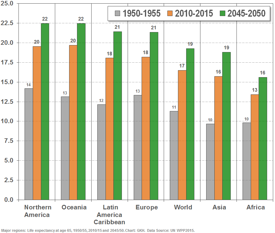
Chart by GKH. Data source: United Nations, WPP2015
Figure 3: Selected countries: Life expectancy at age 65, 1950-2050
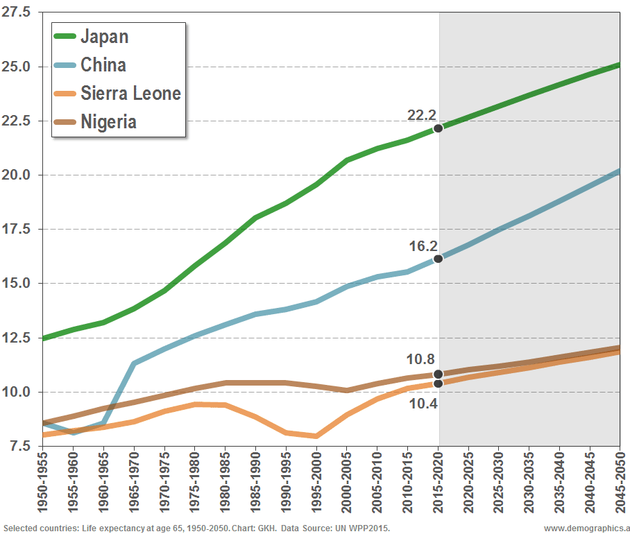
Chart by GKH. Data source: United Nations, WPP2015
Migrant stock by major regions, 1990-2015
Data source: United Nations, Department of Economic and Social Affairs (2015). Trends in International Migrant Stock: The 2015 revision (United Nations database, POP/DB/MIG/Stock/Rev.2015).
Migrant stock in percent of the population by major regions, 1990-2015
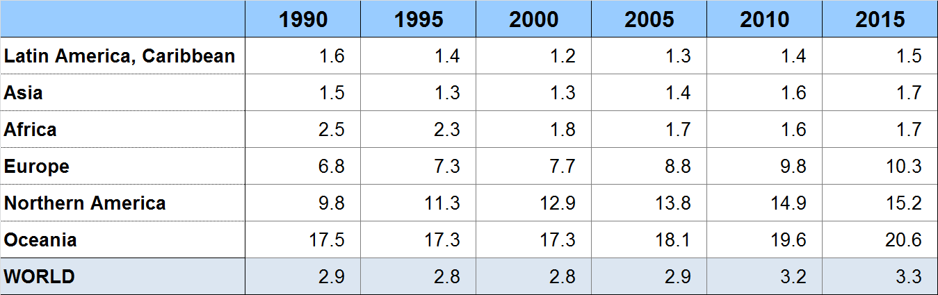
Data source: United Nations, Department of Economic and Social Affairs (2015). Trends in International Migrant Stock: The 2015 revision (United Nations database, POP/DB/MIG/Stock/Rev.2015).
Percentage of the native-borne population living abroad, 2014
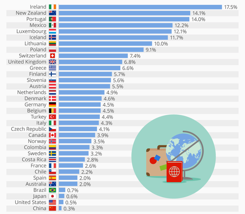
Data source: OECD. Chart: statista.
Q1 What is the inter-generation transfer of wealth?*
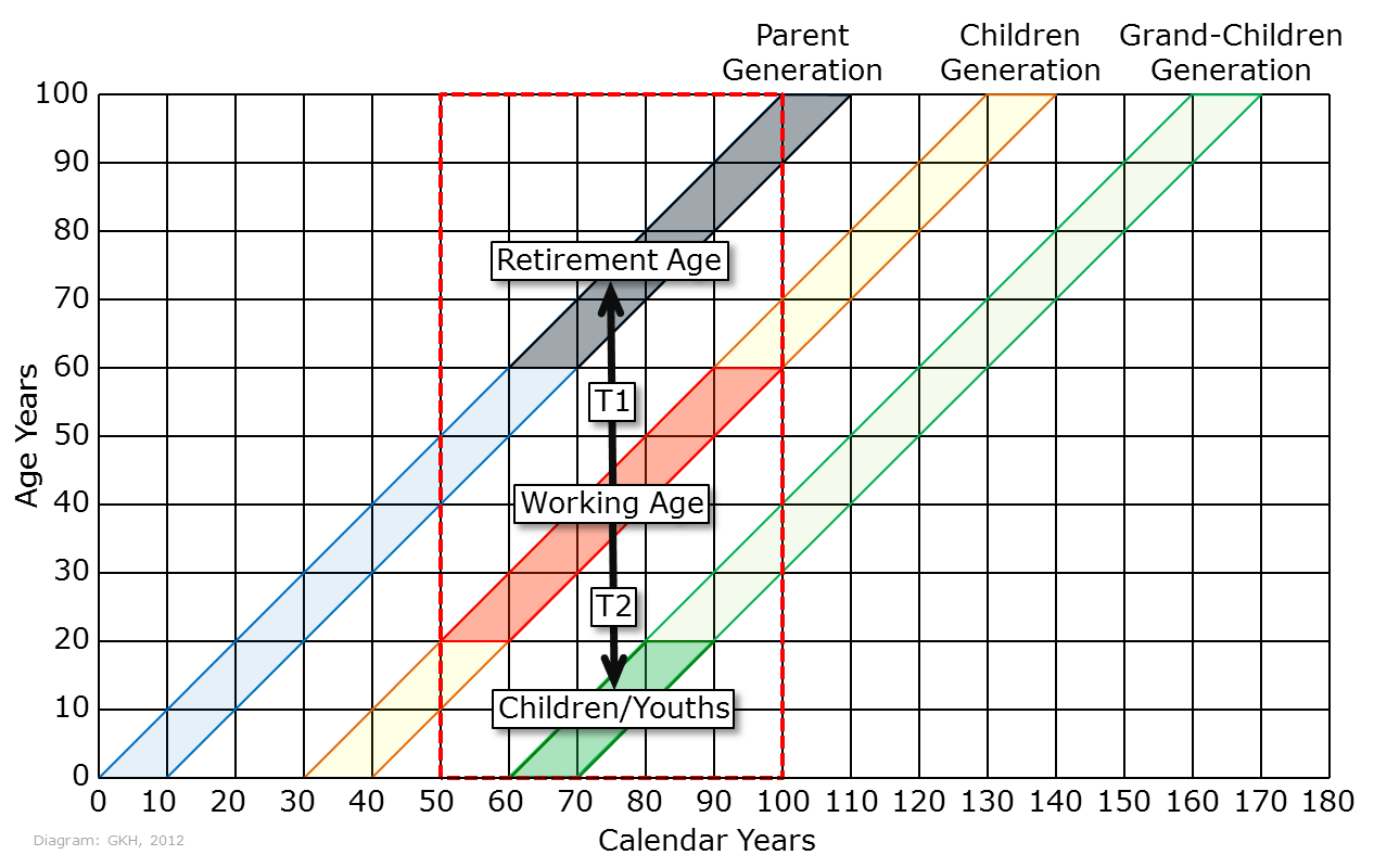
Source: United Nations, WPP2015
Q2 What are consequences of rapid population growth?
Figure 1: Niger, Nigeria, India, China: Average annual rate of population growth (in percent), 1950-2050
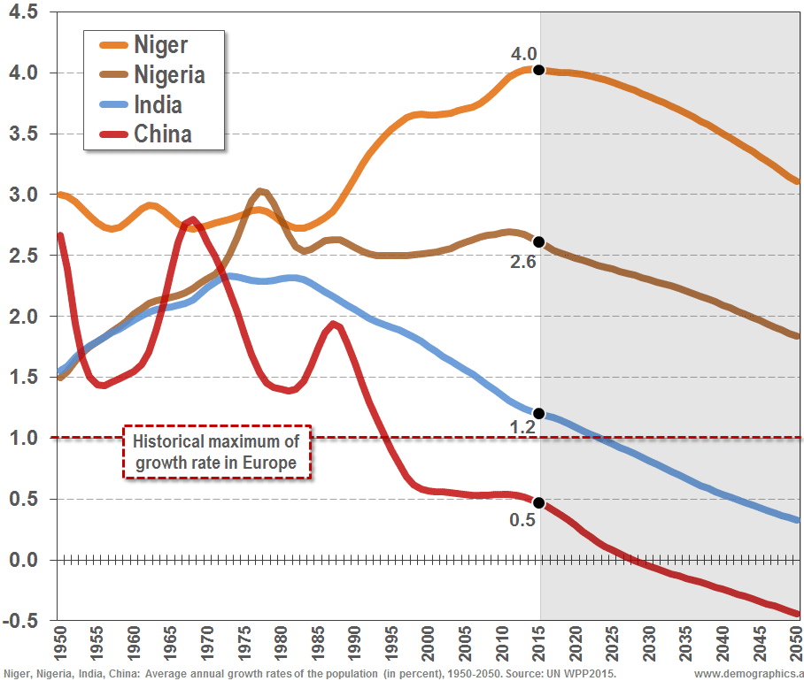
Chart by GKH. Data: UN WPP2015.
Diagram 1: Main consequences of rapid population growth.
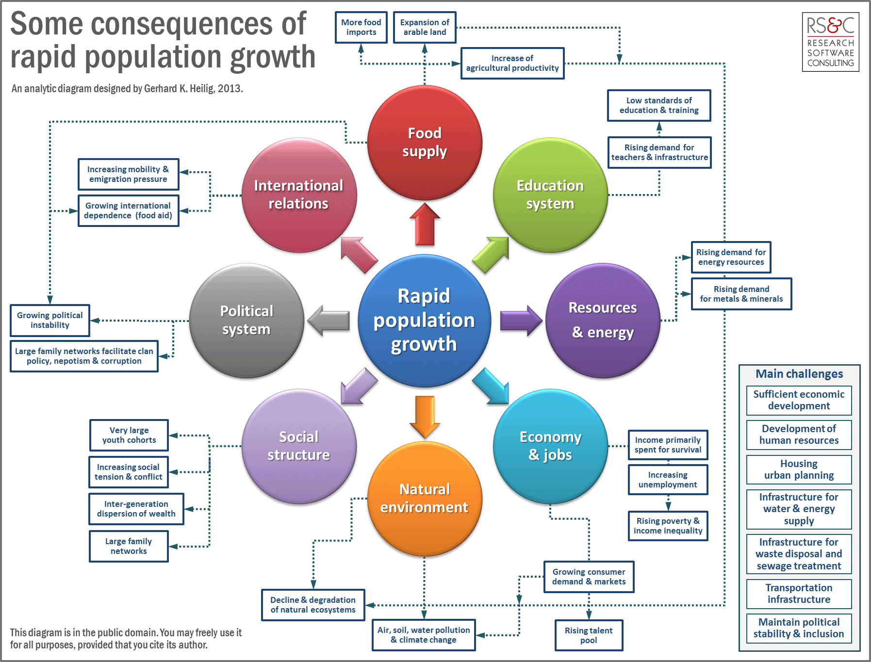
Diagram by GKH, 2010
Q3 What are consequences of population ageing?
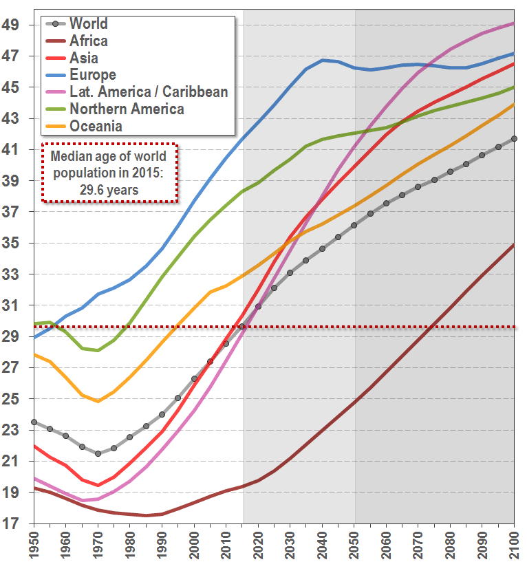
Chart by GKH, 2010. Data: UN WPP2015.
Q4 What are consequences of sub-replacement fertility?
Figure 1: Europe and Northern America: Total fertility (children per woman), 1950-2050
Chart by GKH. Data Source: UN WPP2015.
Note: Scale starts at 1 child per woman.
Note: Scale starts at 1 child per woman.
Figure 2: Major regions: Net-Reproduction-Rate, 1950-2050

Chart by GKH. Data Source: UN WPP2015.
Note: Scale starts at a NRR of 0.6.
Note: Scale starts at a NRR of 0.6.
Figure 3: Europe: Selected low-fertility countries, 1950-2050.
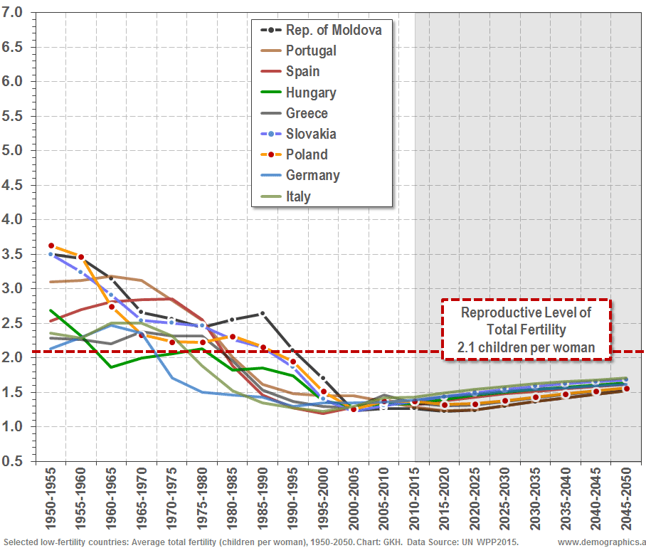
Chart by GKH. Data Source: UN WPP2015.
Note: Scale starts at 0.5 children per woman.
Note: Scale starts at 0.5 children per woman.
Figure 4: Asia: Selected low-fertility countries, 1950-2050
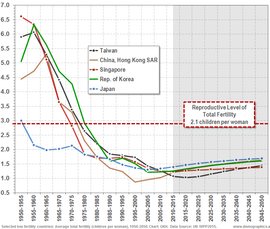
Chart by GKH. Data Source: UN WPP2015.
Note: Scale starts at 0.5 children per woman.
Note: Scale starts at 0.5 children per woman.
Figure 5: Countries with lowest Net Reproduction Rate in 2010/15, 1950/55 and 2010/15

Chart by GKH. Data Source: UN WPP2015.
Q5
Which country has the largest number of children (aged 0-14)?
Figure 1: Number of children (0-14): Top-15
countries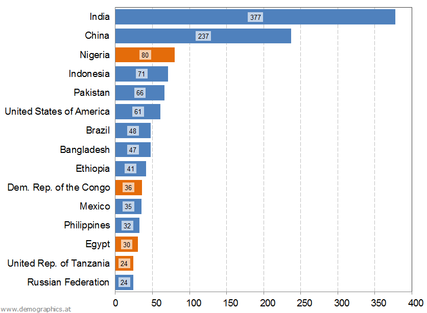
Chart by GKH. Data Source: UN WPP2015.
Figure 2: Percentage of children: Top and bottom 15
countries, 2015
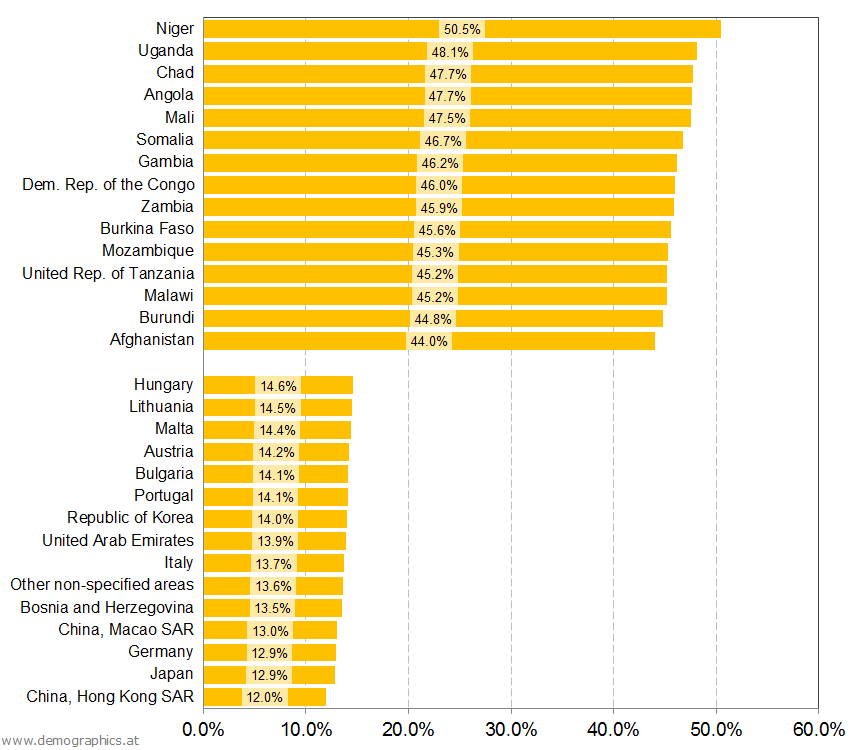
Chart by GKH. Data Source: UN WPP2015.
Q6
Which country has the largest number of elderly (aged 65+)?
Figure 1: Number of elderly (age 65+): Top-15
countries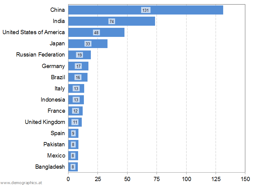
Chart by GKH. Data Source: UN WPP2015.
Figure 2: Percentage of elderly (age 65+): Top and bottom 15
countries, 2015
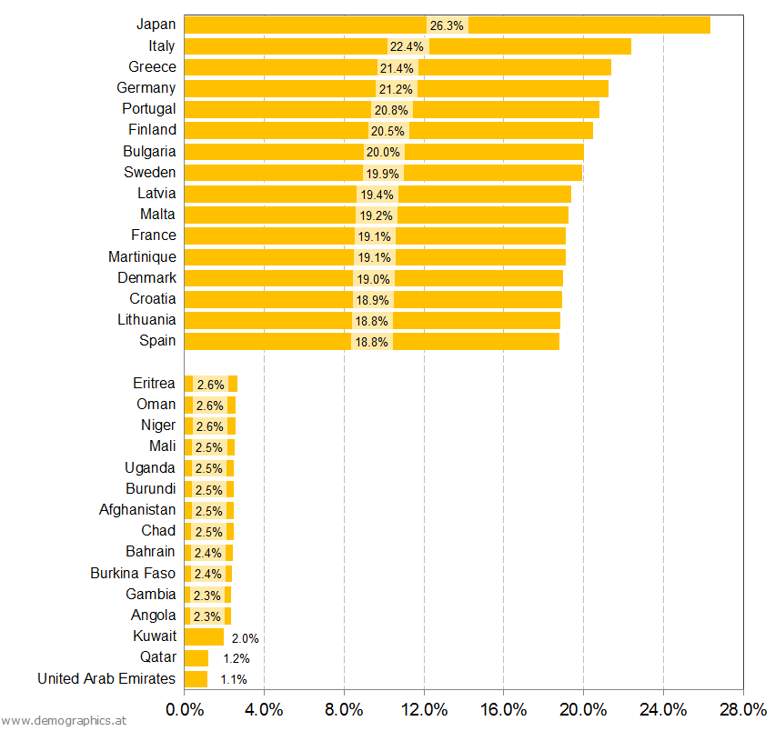
Chart by GKH. Data Source: UN WPP2015.